Digital Illustration Style Guide
We aim to illustrate a world where everyone is financially empowered to take charge of their life, no matter the stage they’re at.
Our illustration style builds off our brand system - from the colours, lines, and shapes - they are intended to make information digestible and delightful in a contextual and meaningful way.

Types of Illustration

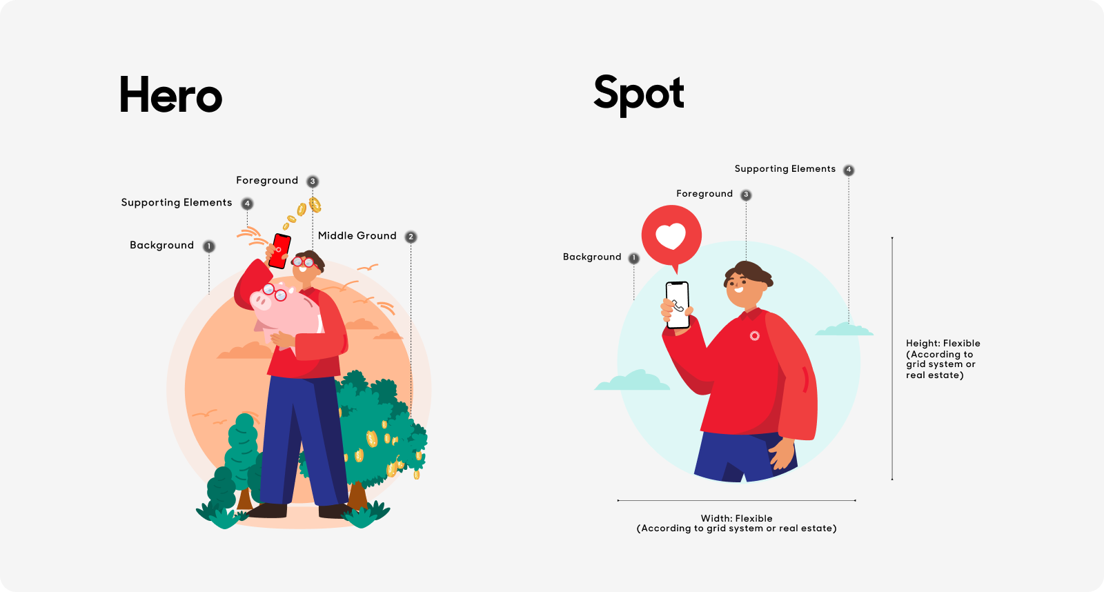
Hero
Used to convey complex, metaphorical, yet contextual narratives about our products and services. Hero illustrations should contain background, middleground, foreground, as well as supporting elements.

Spot
Used in smaller and lighter contexts, spot illustrations are typically more literal than heroes. They should be accompanied with copy most of the time.

Badge
A badge is the literal visual translation of a concept. One or more badges can be used to support the narrative in a hero or spot illustration. Often they are background elements and not people.

Anatomy
Illustrations are made up of the following:
- Background: The circle acts as a backdrop to draw attention to the piece of information we’re currently communicating - whether it’s a person, place, illustration or product.
- Middle Ground: Elements in the middle ground are used to create depth and balance to an illustration.
- Foreground: The ‘hero’ of the illustration is displayed at the foreground - whether it is a person(s), place, illustration or product. Hero(es) in action should always be displayed in the foreground.
- Supporting Elements: The usage of supporting elements, such as badges, doodles, and partial bursts should primariyl be used to highlight a moment of interaction by tracking to gestures or hands. They can also be thoughtfully used on a background for stylistic purposes.
Color Roles for Illustrations
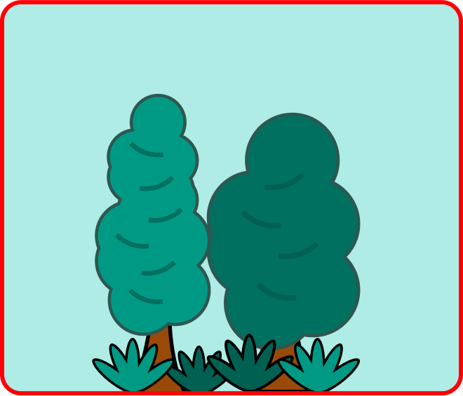
Tonal values are especially useful for indicating depth. Here's one example of how tones can be used in an illustration:
- Teal 80 is applied.
- Teal 90 is applied on the shadow.
- Mandarine 20-0 is applied to the background to make it less prominent.
- Skin tone and hair color are colors that should be considered outside of the color scheme. Singlife x Aviva character colours are used on the main subject for prominence.
Singlife x Aviva character colours are used on the main subject for prominence

Here’s how the below image would look with a different color scheme but the same color roles.

A full tonal color scheme can also be used for illustrations with less complexity. Here the tonal values of the color are applied to a single illustration.
- Red 40
- Red 60
- Cool grey 70
- Cool gray 30
- Blue 40
- Blue 60

Implementation
SVGs are the most efficient format for illustrations to adapt the colors as it has flexibility of control in applying the established color system to the different parts of a single illustration.

Best Practices