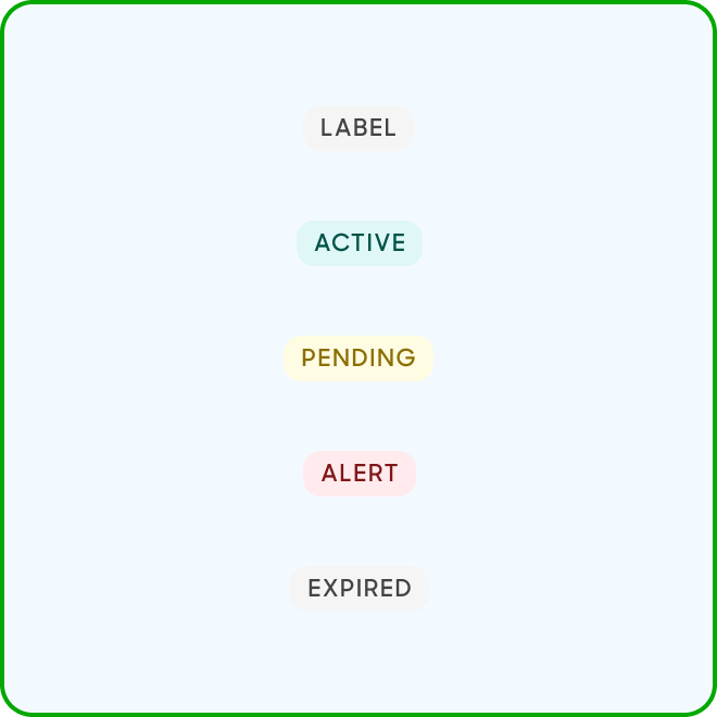
Labels
Labels are used to display quick and useful category filters
for the users.
Variants
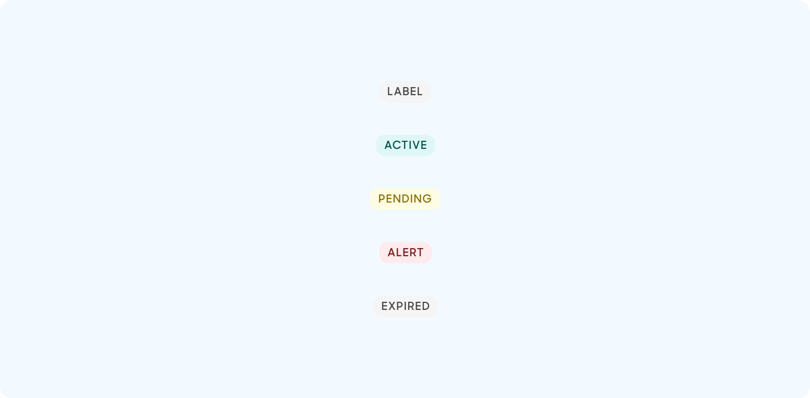
| Variant | Usage |
|---|---|
|
Default |
Default style of labels. Used typically to represent categories for filters. |
|
Active |
Used for feedback. Represents “Active” state items. |
|
Pending |
Used for feedback. Represents “Pending” state items. |
|
Alert |
Used for feedback. Represents “Alert” state items. |
|
Expired |
Used for feedback. Represents “Expired” state items. |
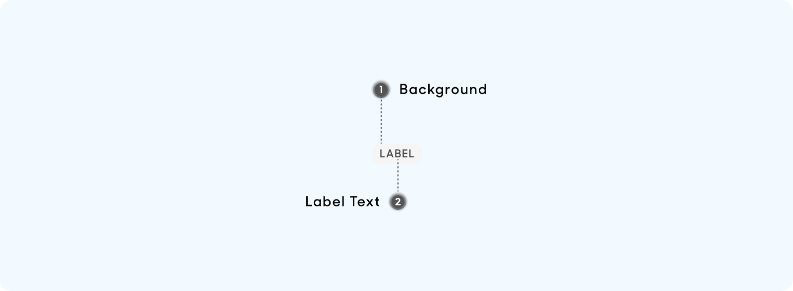
Anatomy
All labels are made up of the following:
- Background: Solid color background depending on the type of label.
- Label Text: Length of text determines the width of label which is dynamic.
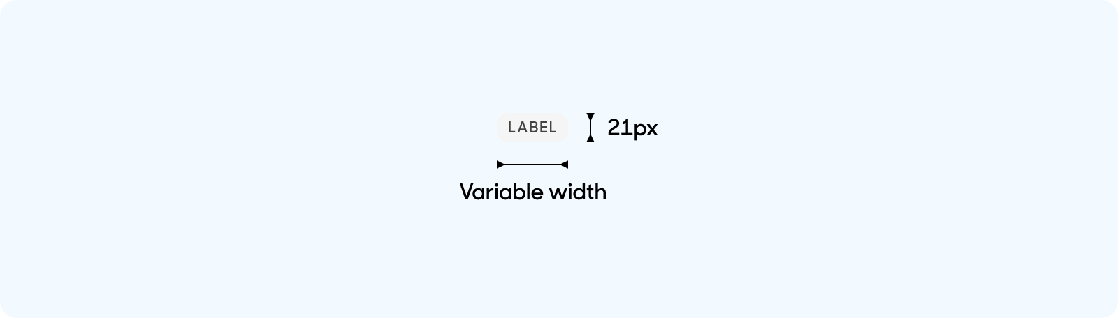
Size
Labels are all 21px in height and are variable in width depending on the length of the label text.
Text Style
All labels use the same text size.
- Text size at 14px, title case, uppercase. Use “Tag” text style on Figma for all label types.

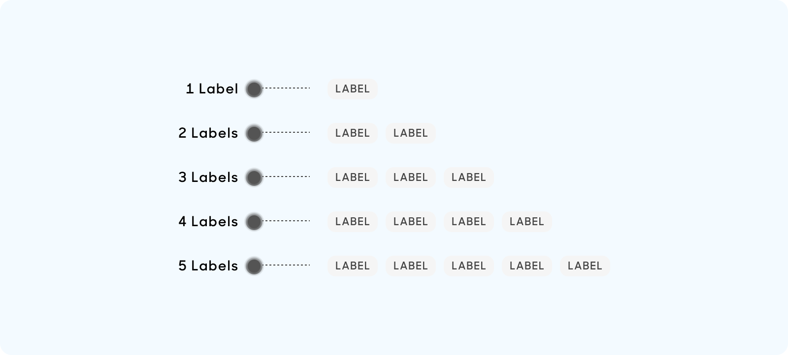
Behavior
Examples of usage of labels:
Dos and Don'ts
Use only predetermined solid colors for label, and ensure that label text is always Uppercase.
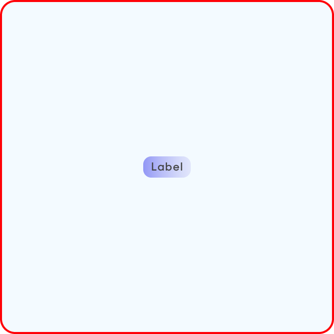
Use gradients or Sentence case on labels.