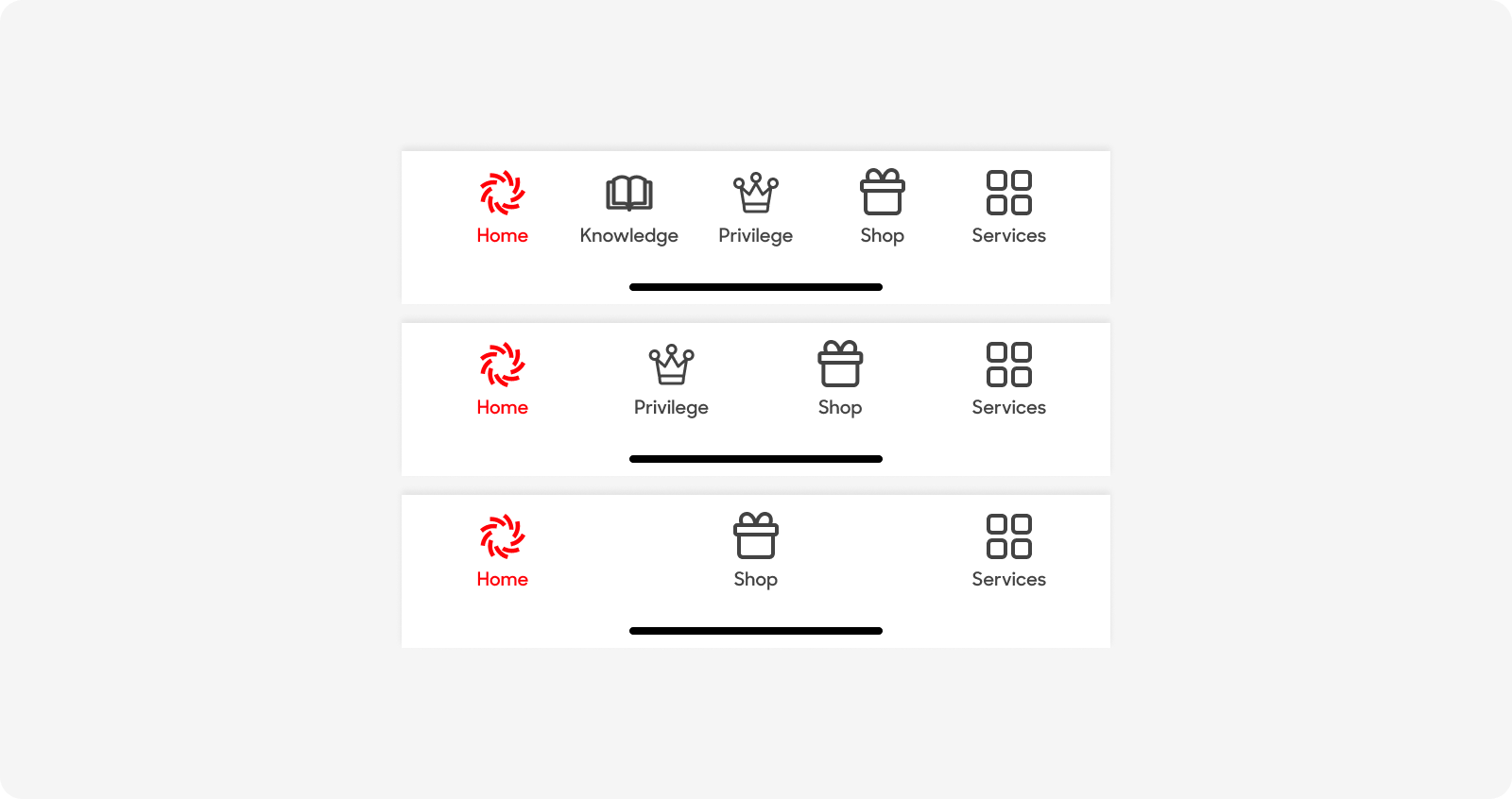
Main Navigation
The Main Navigation is a fixed navigation menu on the app that remains visible and in the same position as the user navigates the app.
Variants
Main Navigation
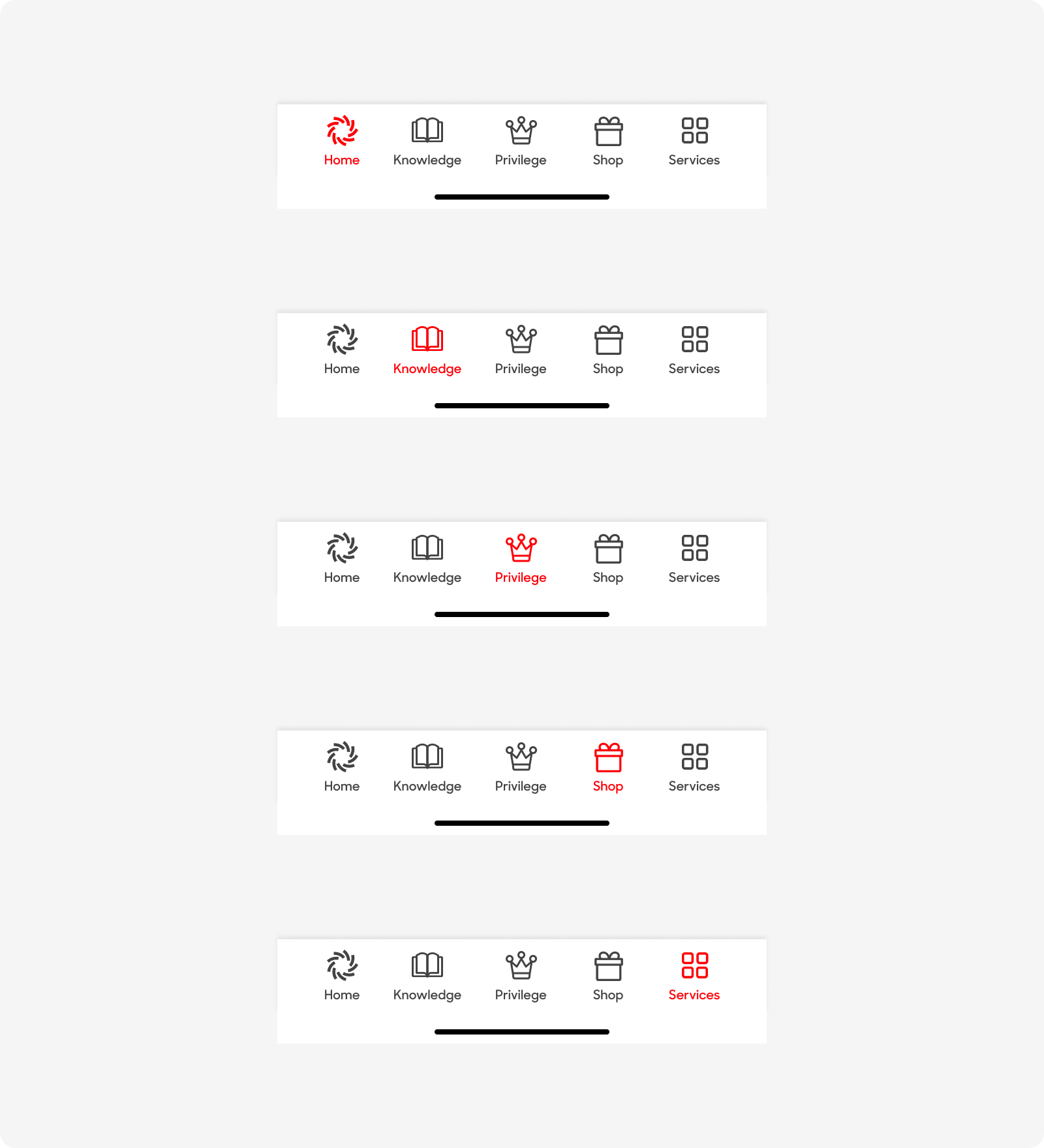
| Variant | Usage |
|---|---|
|
Home |
Home tab selected |
|
Knowledge |
Knowledge tab selected |
|
Privilege |
Privilege tab selected |
|
Shop |
Shop tab selected |
|
Services |
Services tab selected |
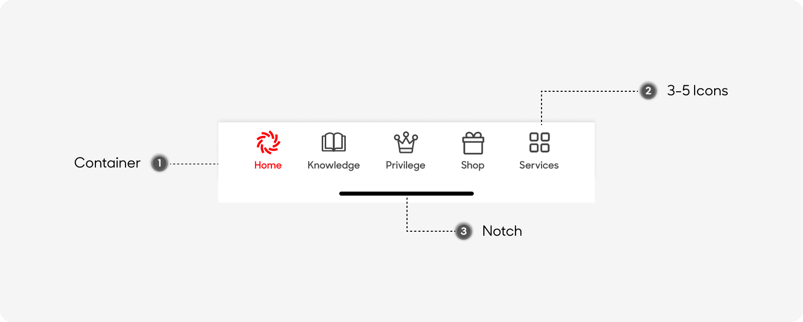
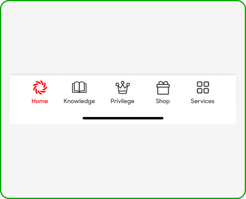
Anatomy
The main navigation is made up of the following;
- Container: Holds all icons.
- 3-5 Icons: 3-5 Icons that function as buttons for navigation.
- Notch: Native iOS component, enables user to swipe up to exit.
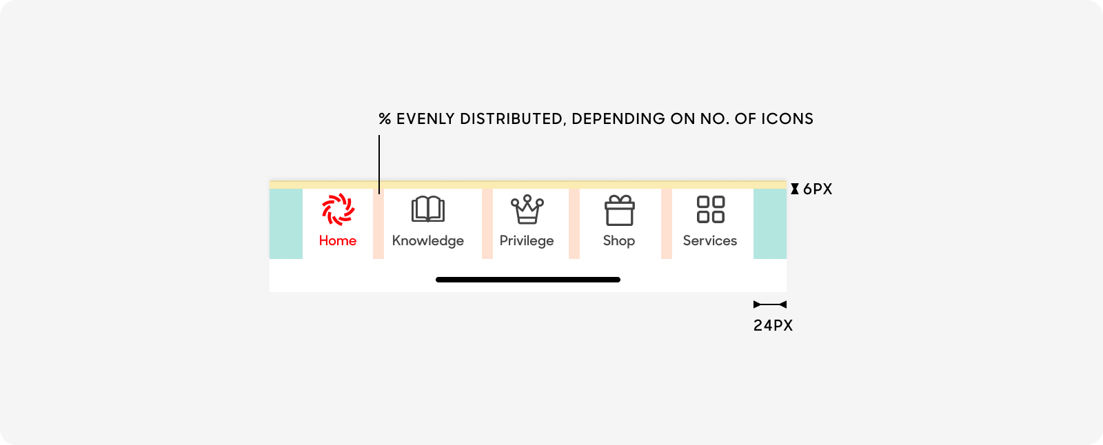
Size
The main navigation:
- Has a left and right padding of 24px.
- Has a top and bottom padding of 6px.
- Space between icons should be equal, where icons are evenly distributed.
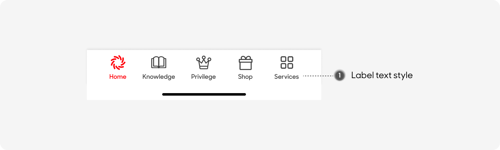
Text Style
Main navigation consists of only one text style, the label underneath the icons:
- The text has a size of 10px, and is semibold. Use “Label” text style on Figma.
Behavior
Background and pop up modal fades in immediately. Allow customers to tap on a button or tap outside the modal to dismiss. Use as little as possible.
Dos and Don'ts
Use 3-5 icons within the main navigation, and keep labels short and concise.
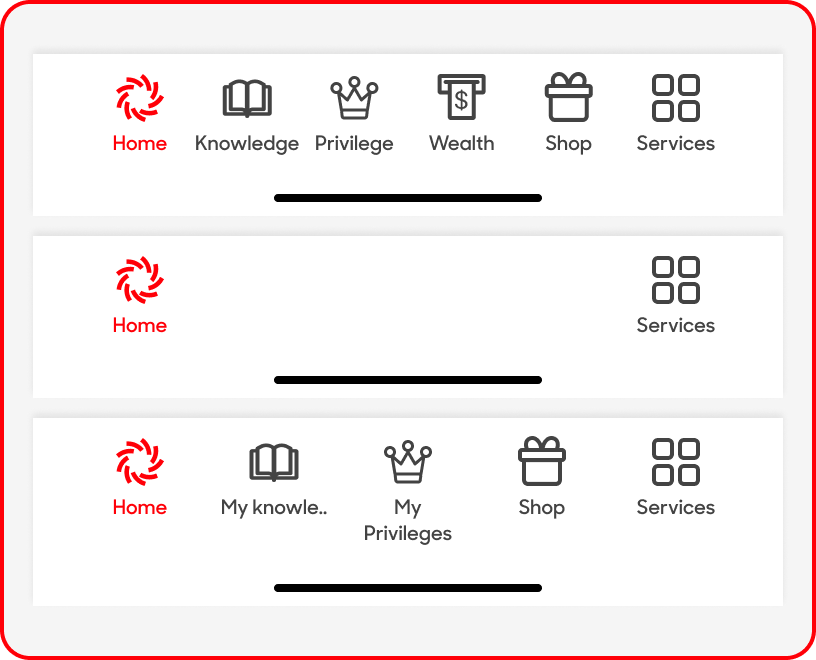
Use less than 5 or more than 3 Top Level/Navigational menu items, truncate labels or wrap text within the main navigation bar.