Cards (Testimonials)
Cards are containers that group related information and action
about a single subject.
Variants
Testimonial Card

| Variant | Usage |
|---|---|
|
Testimonial Card |
This is used to represent a grouped view of a single testimonial provided by a single source. |
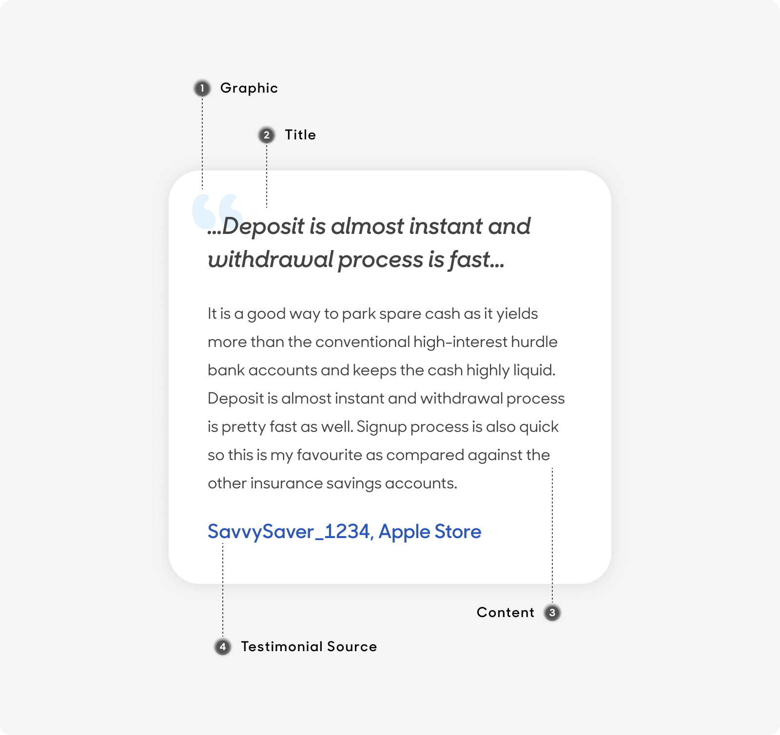
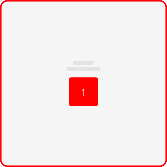
Anatomy
All Testimonial Cards are made up of the following:
- Graphic: Indicates card content comprises of a testimonial.
- Title: Overview of the overall content.
- Content: Text content that describes and support the testimonial .
- Testimonial Source: Identifies the user that wrote the testimonial and the source of where the testimonial had been posted.
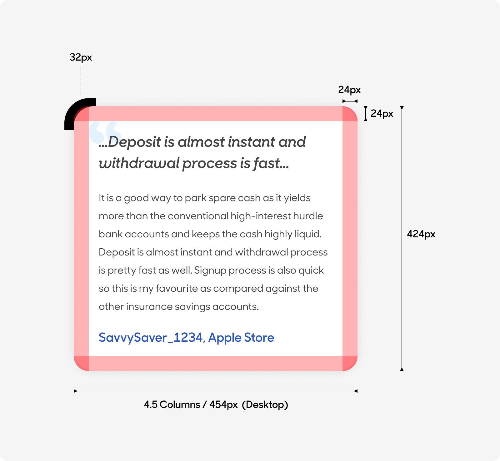
Size
- Desktop: Fixed to 454px (4.5 columns in the desktop grid system).
- Mobile: Fixed to 327px (4 columns in the mobile grid system).
Text Style
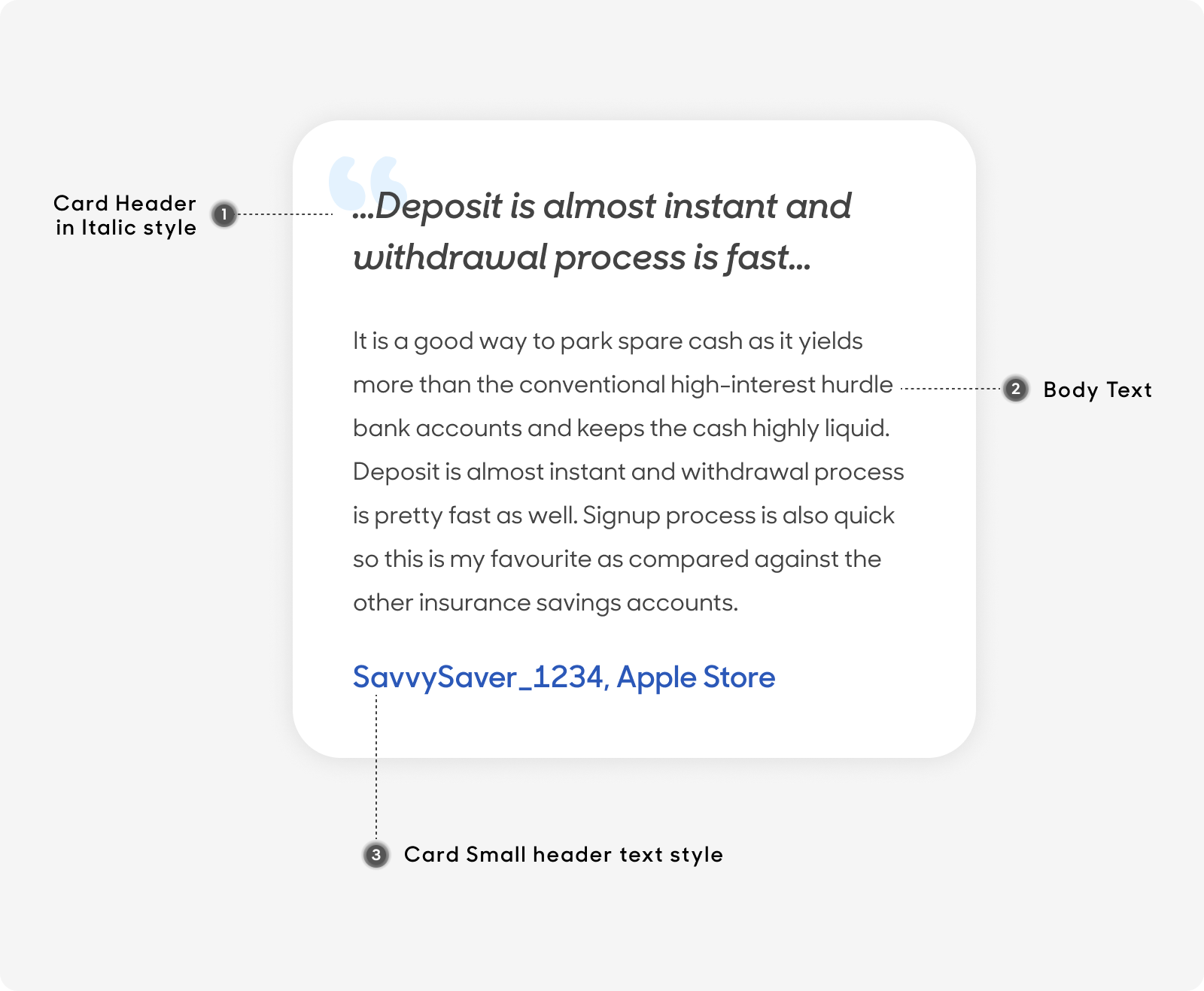
Desktop
- Card Header text at 24px, semibold and italic.
- Body text at 16px. Use “Body/Long Text Wall” text style on Figma.
- Testimonial Source text at 20px. Use “Card-Small Header/H4_semibold” text style on Figma.
Mobile
- Card Header text at 20px, semibold and italic.
- Body text at 16px. Use “Body/Long Text Wall” text style on Figma.
- Testimonial Source text at 20px. Use “Card-Small Header/H4_semibold” text style on Figma.
Dos and Don'ts
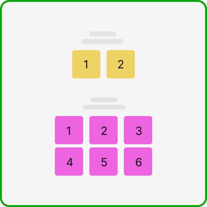
Ensure that you have at least 2 and up to a maximum of 6 cards when using this type of card.
Do not use this design type of card if you only have enough content for 1.