Popups
Popups are dialogs that present critical information that requires user input to complete their workflow.
Variants
Popup Modals
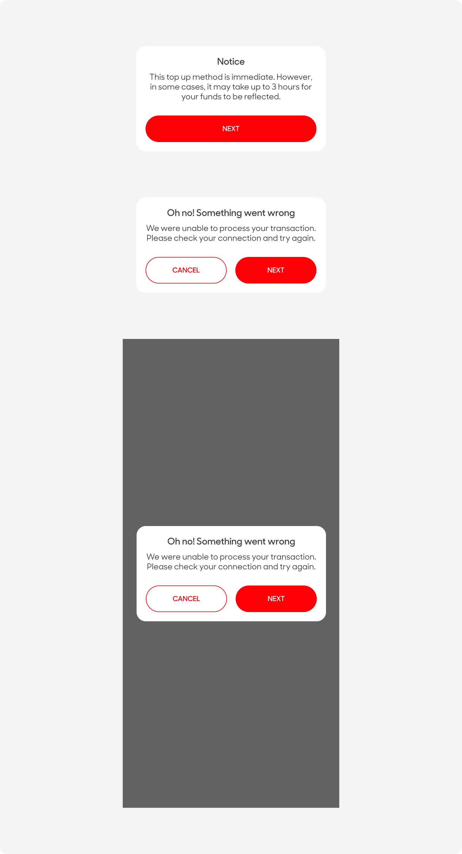
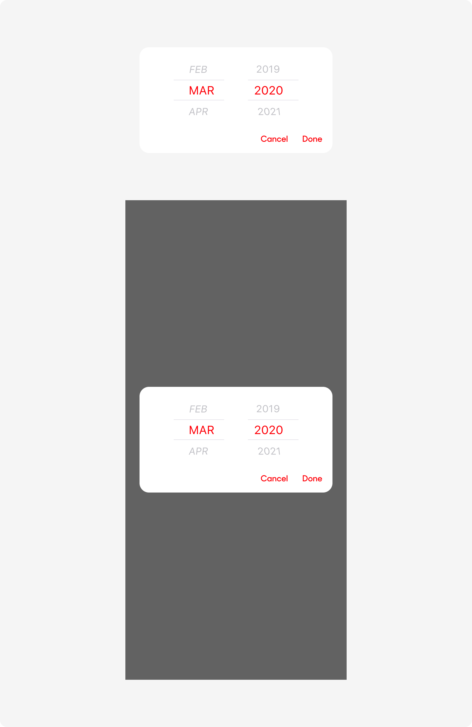
Popup Modal - With Datepicker
| Variant | Usage |
|---|---|
|
Popup Modals |
Sed ut perspiciatis unde omnis iste natus error sit voluptatem accusantium doloremque laudantium, totam rem aperiam, eaque ipsa quae ab illo inventore veritatis et quasi |
|
Popup Modals (Date Picker) |
These requires user to input a date in MM/YYYY format. |
Anatomy
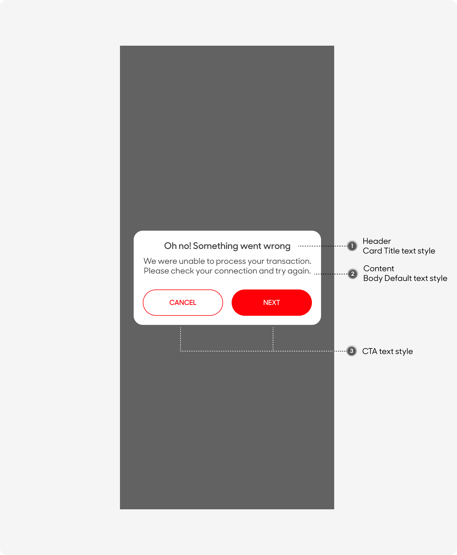
Popups are made up of the following:
- Background: Overlays over the original content on the screen.
- Modal: Background of the popup modal.
- Title: Overview of the popup content.
- Body: Description of the popup content,
- Call-to-Action: Actions required by the user to take in order to dismiss the popup.
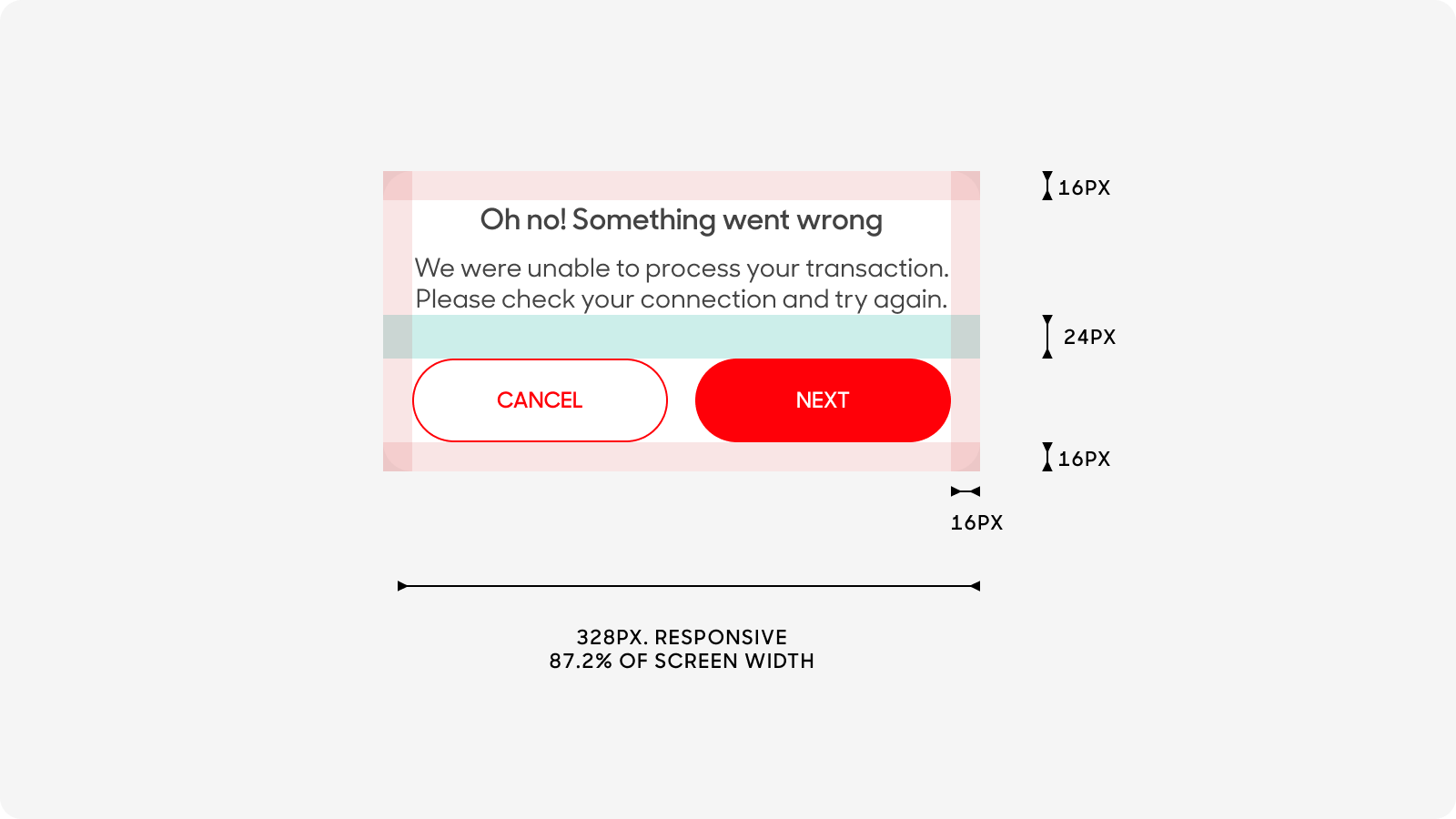
Size
Popups:
- Have a 16px padding around the content.
- Takes up to 87.2% of the screen width, capped at 328px.
Text Style
Popups consists of 3 types of text styles:
- Header has a text size of 16px. Use “Card Title” text style on Figma.
- Popup body text has a size of 14px. Use “Body Default” text style on Figma.
- Call-to-Action button’s text has a size of 12px. Use “CTA” text style on Figma.
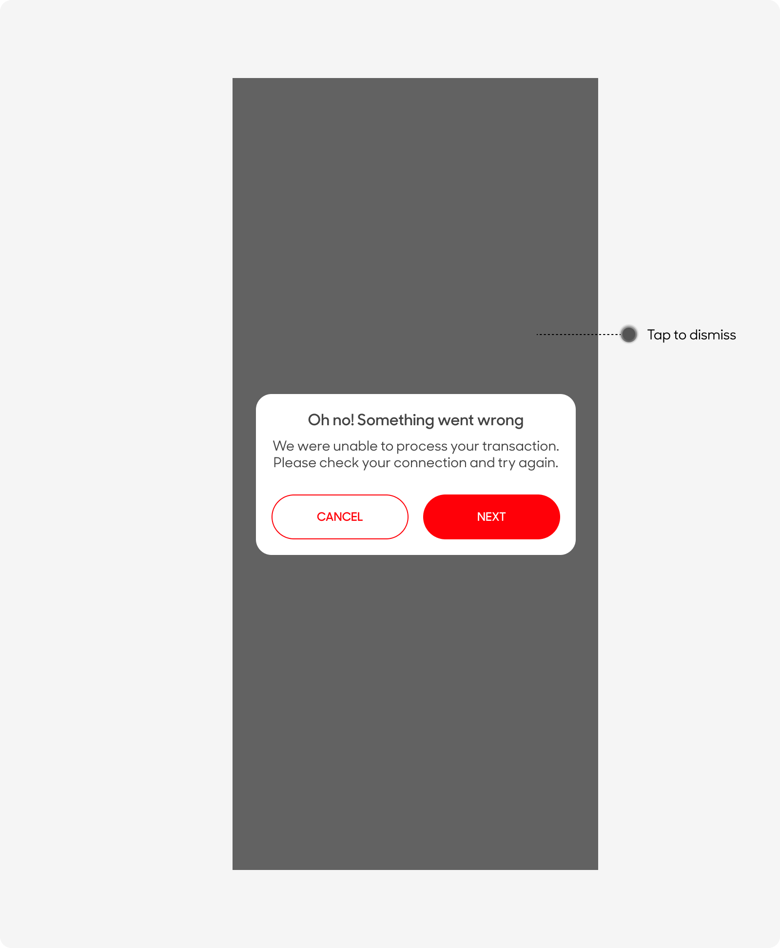
Behavior
Background and pop up modal fades in immediately. Allow customers to tap on a button or tap outside the modal to dismiss. Use as little as possible.
Dos and Don'ts
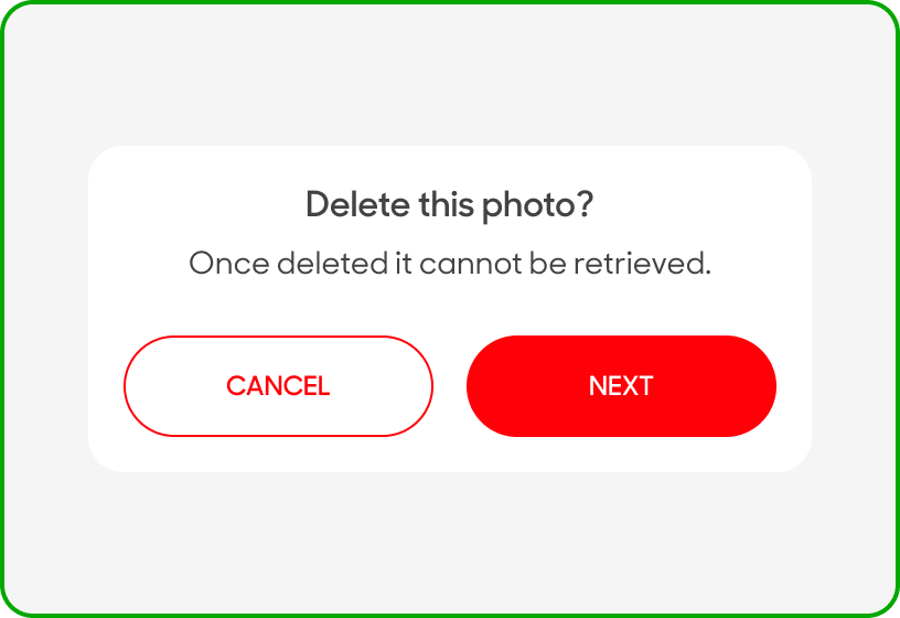
Restate the intended action clearly, especially for actions that cannot be undone. e.g. “Delete photo?”. Save modals for high-impact mesaging. Engage, don’t enrage your users.
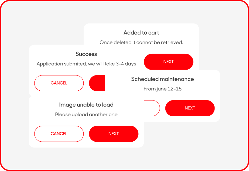
Use Popups everywhere. Modals can be very disruptive. For small announcements, stick to more subtle UI patterns such as Toasts. Also, don't hold your users hostage. It should be easy for users to leave the modal window and get back to your main application.