Links
Links are navigational elements that direct or redirect users to
other pages or sites.
Variants
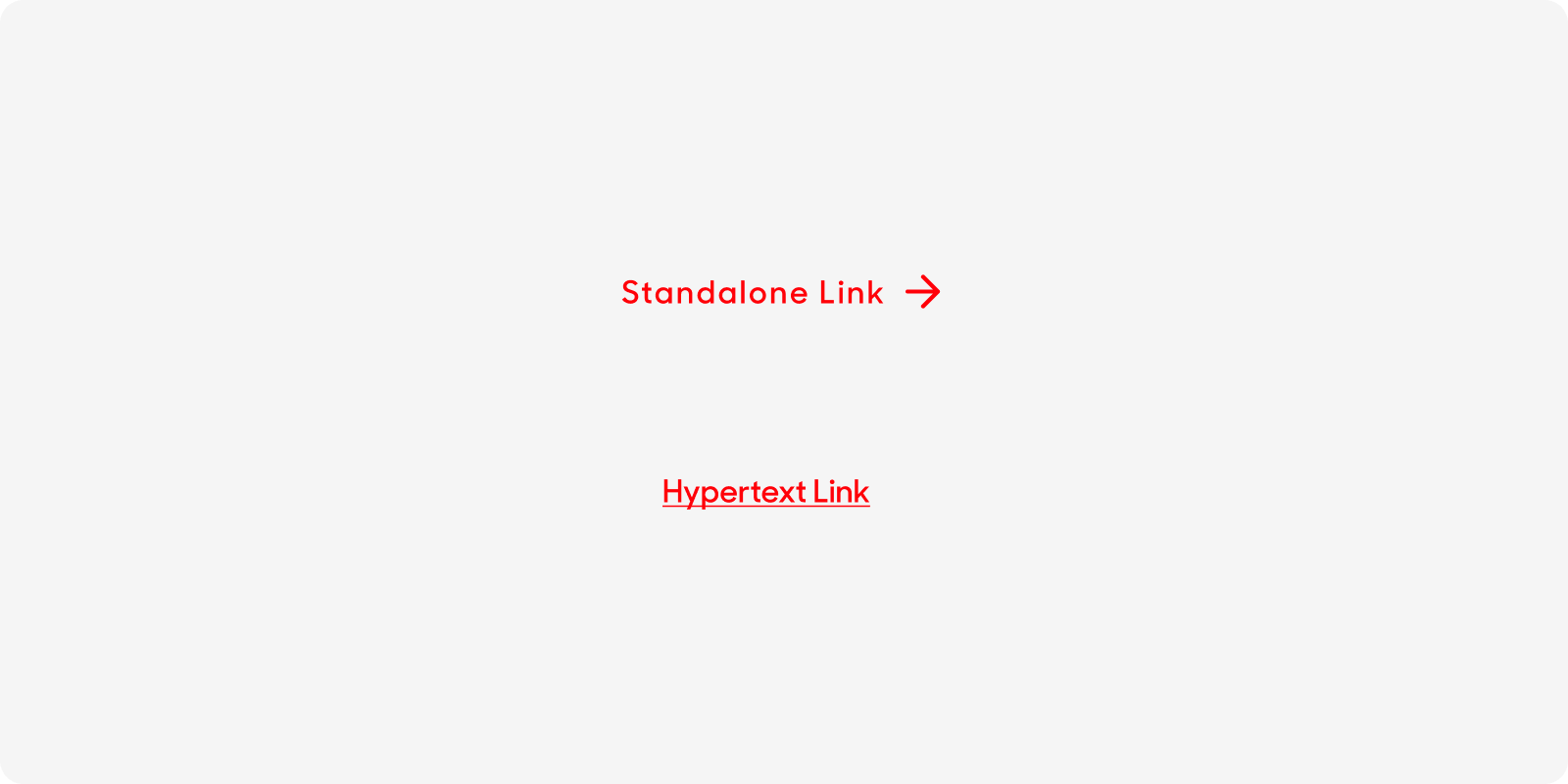
Standalone Link
| Variant | Usage |
|---|---|
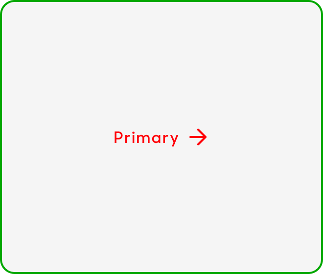
|
Standalone Link |
Standalone links features an arrow icon and are to be used independently. The arrow icon shifts in position when mouse over to indicate to the user that the navigation progresses the user to the next step. |
|
Hypertext Link |
Hypertext are clickable links in a body or wall of text. They are in singlife red, semi-bolded and underlined. |
Anatomy
Standalone Link
- Use “Standalone Link” text style from library.
- Arrow icon.
- In Singlife Red.

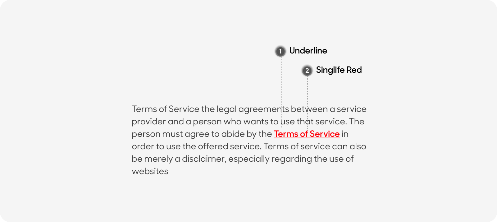
Hypertext
- Underline.
- In Singlife Red.
Size
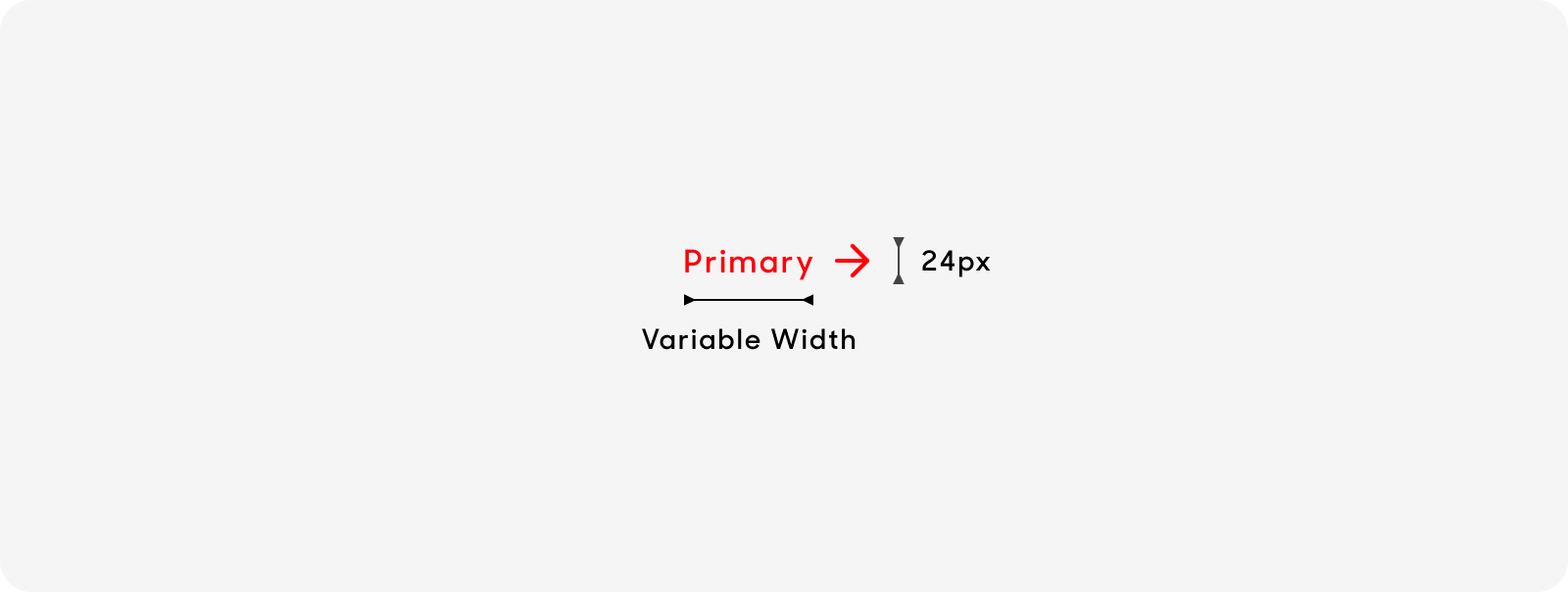
Standalone links have a variable width depending on its text length, and a fixed height of 24px.
Text Style
Standalone Links
- For standalone links, please use “Standalone link” text style on Figma. Text size at 16px, Semibold or weight 600.
- Title case (i.e. Click Here, Sign Up Now).

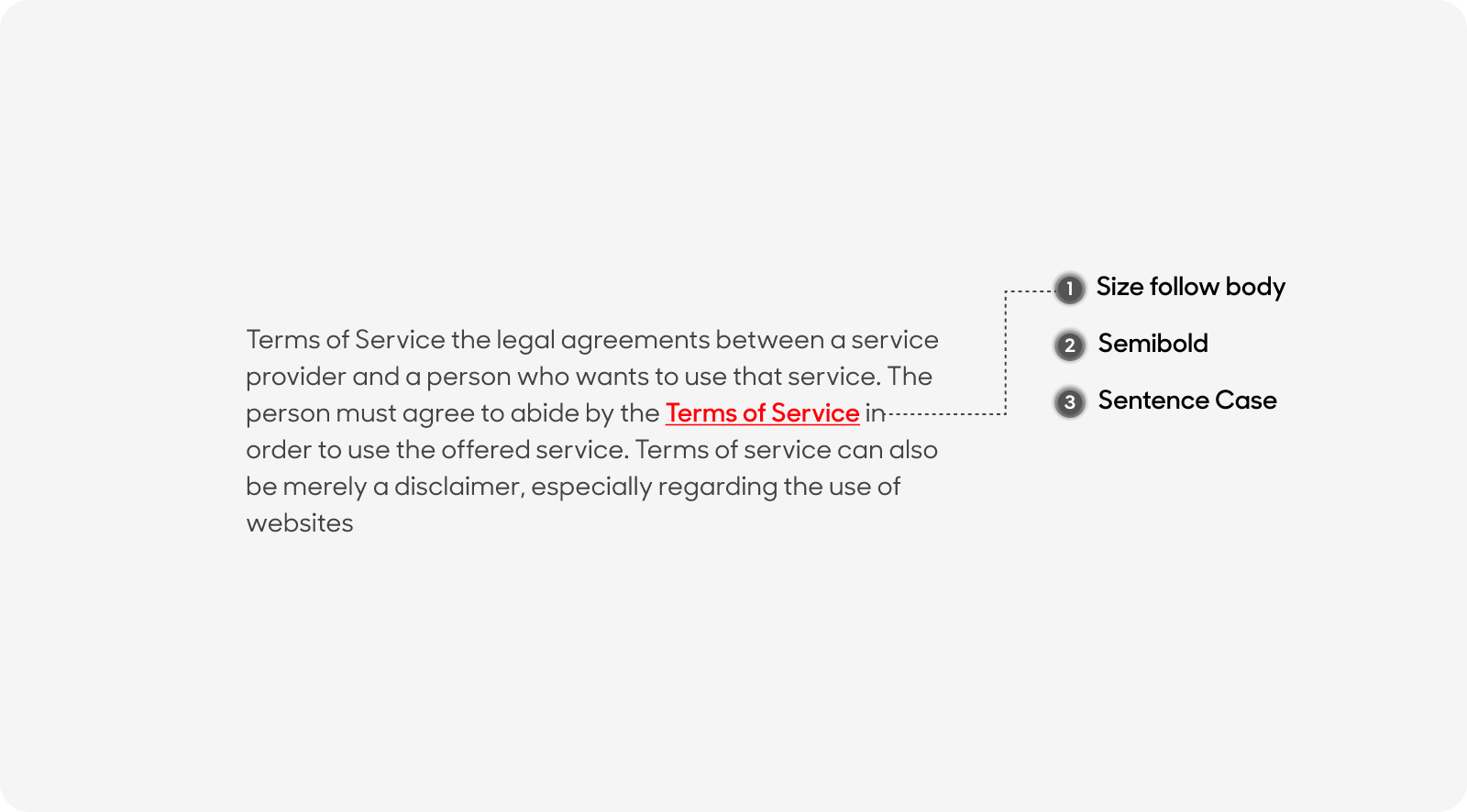
Hypertext
- Text size to follow main body
- Weight at Semibold or 600
- Sentence case
Dos and Don'ts
Use the same text size across all links and stick to the same layout.
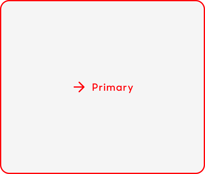
Do not place the icon before the Link text.

Correct use of our hypertext style and language

Missing Singlife Red