Selectors
Selectors are inputs used to allow to the user to choose between two
or more mutually exclusive options.
Variants
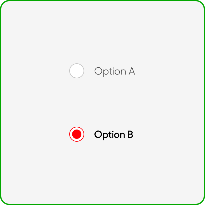
Radio Selector

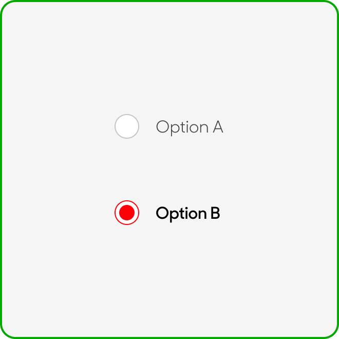
Radio with Title

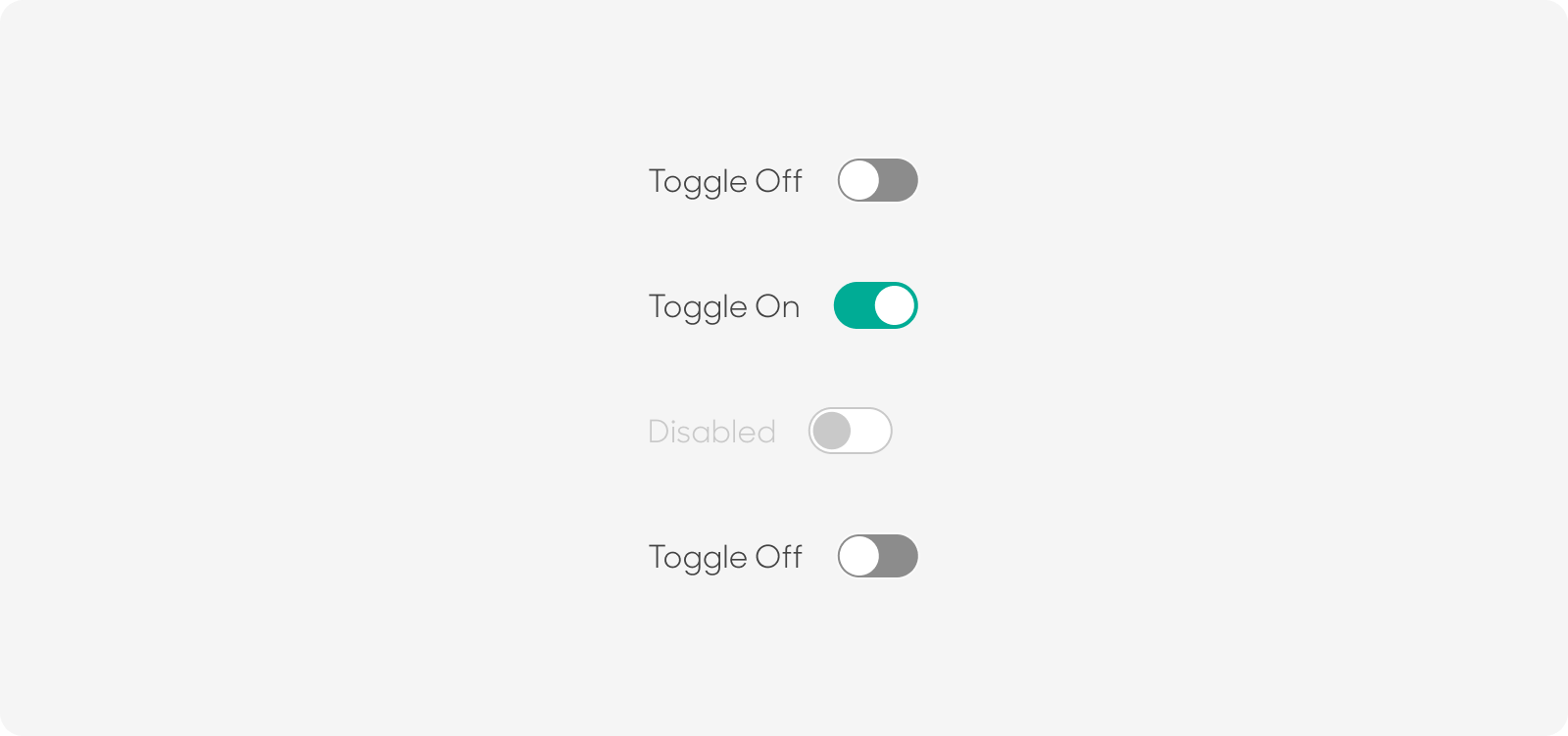
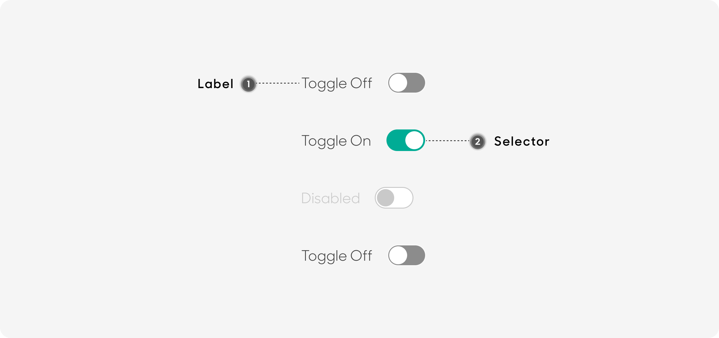
Toggle
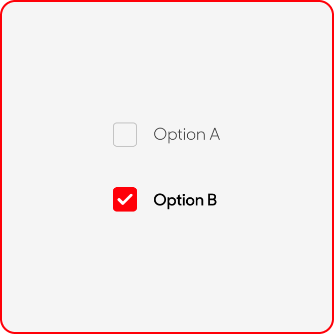
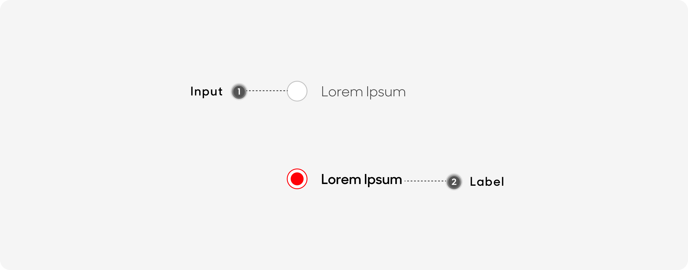
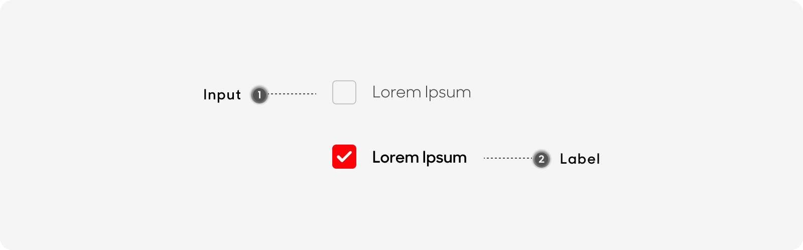
Checkbox

| Variant | Usage |
|---|---|
|
Radio Selector |
Provides two options for the user to select one. |
|
Radio with Title |
Provides two labelled options for the user to select one. |
|
Toggle |
Allows users to select between two possible states. |
|
Checkbox |
Lets user select one or more options at the same time |
Anatomy
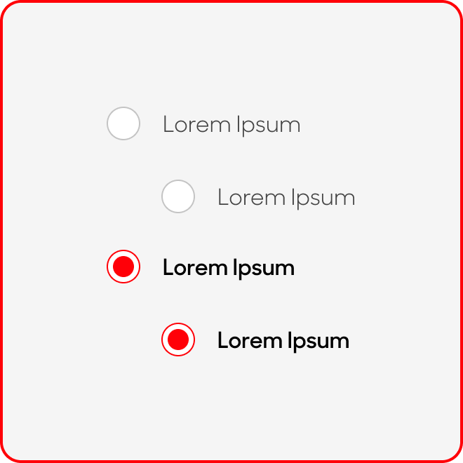
Radio Button
- Input: Selector
- Label: Describes the option that is provided
Toggle
- Label: Describes the option that is provided
- Selector: For user to toggle between on/off
Checkbox
- Input: Selector
- Label: Describes the option that is provided
Size
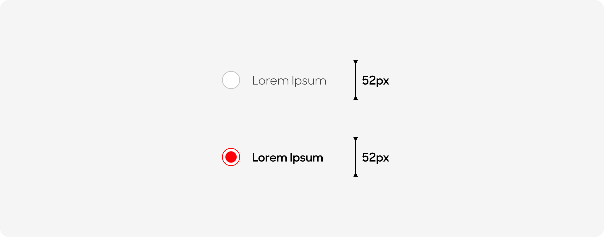
Radio Button
Radio buttons have a height of 52px, and a variable width which is dynamic according to the length of text.
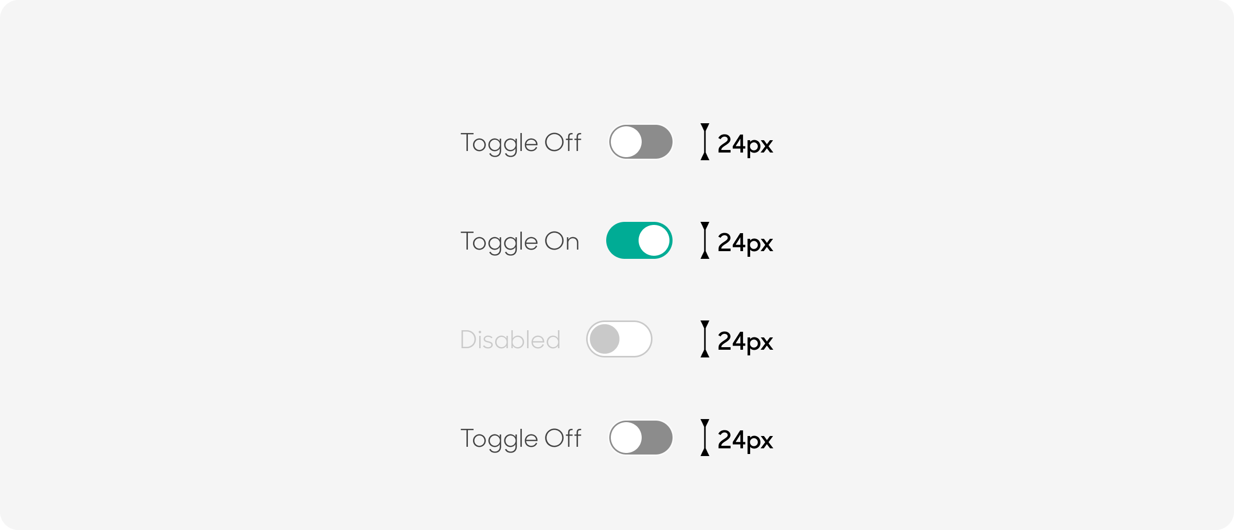
Toggle
Toggles have a fixed height of 24px (following the Selector), and a variable width which is dynamic according to the length of text.
Checkbox
Checkboxes have a fixed height of 24px (following the Input), and a variable width which is dynamic according to the length of text.

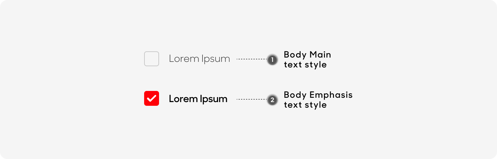
Text Style
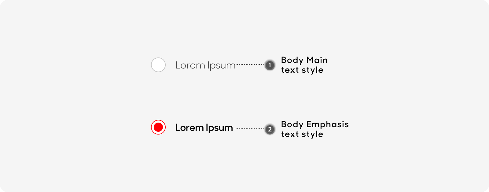
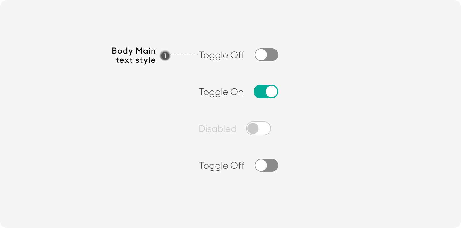
All Radio Buttons and Toggles have the same text size of 16px.
- Use “Body/Main” text style on Figma for selection text.
- Use “Body/Emphasis” text style on Figma for Radio Button’s selected item text.
Radio Button
Toggle Button
Checkbox
Dos and Don'ts