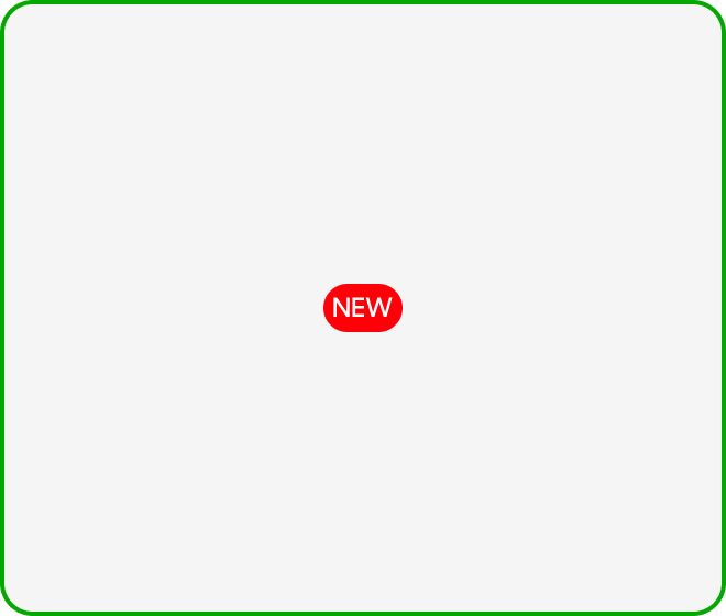
Notifications (NEW)
New Badges are used to indicate new features/content.
Variants
Lorem ipsum dolor sit amet, consectetuer adipiscing elit. Aenean commodo ligula eget dolor. Aenean massa. Cum sociis natoque penatibus et magnis dis parturient montes, nascetur

| Variant | Usage |
|---|---|
|
New Badge |
Used to indicate that there are new features or content. |
Anatomy
New Badges are made up of the following:
- Container: Houses the text label.
- “NEW” text: Indicates that the accompanied component is new.

Size
New Badges:
- Have an 8px outer padding.
- Are 20px in height.
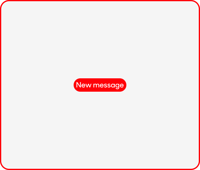
- Has a dynamic width, capped at 87.2% (327px) of screen.

Text Style
New badges consists of only one text size
- Text size at 12px, semibold and use Uppercase. Use “Label or Note” text style on Figma.

Behavior
Appears for X weeks from date of launch. It should disappear once expired

Dos and Don'ts
Keep "NEW" badge near the action button
Change the copy and write in letter or sentence case