Text Fields
Text fields allow for the users to input and edit text.
Variants
Text Fields
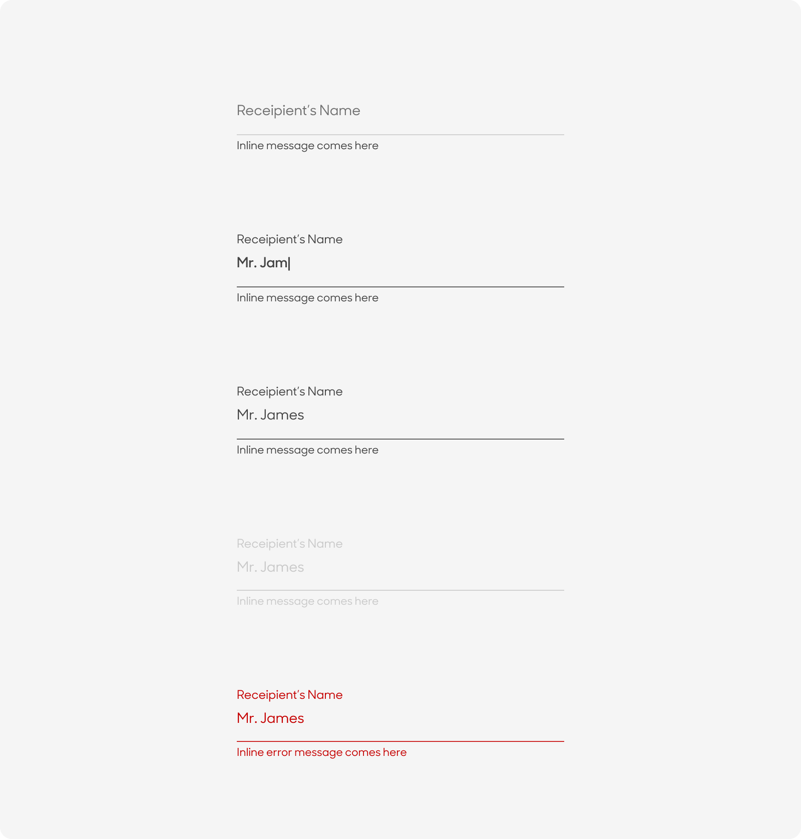
| Variant | Usage |
|---|---|
|
Default |
Text field on load state |
|
Typing |
Text field as the user inputs information |
|
Filled |
When information has been input into the field |
|
Disabled |
Text field is not available for input |
|
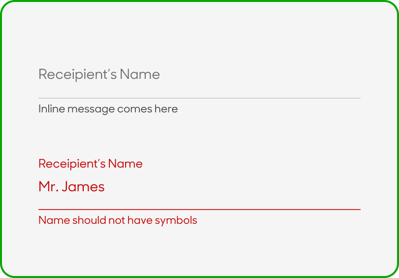
Error |
Text box validated with an error |
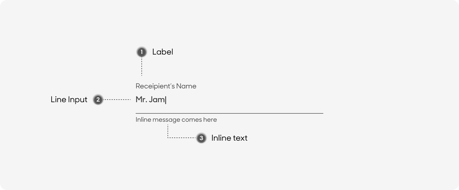
Anatomy
Lined Textfields are made from the following:
- Text label: All variants except for Default will have text labels
- Line: Containers can expand, and can be solid or outlined
- Inline message
Size
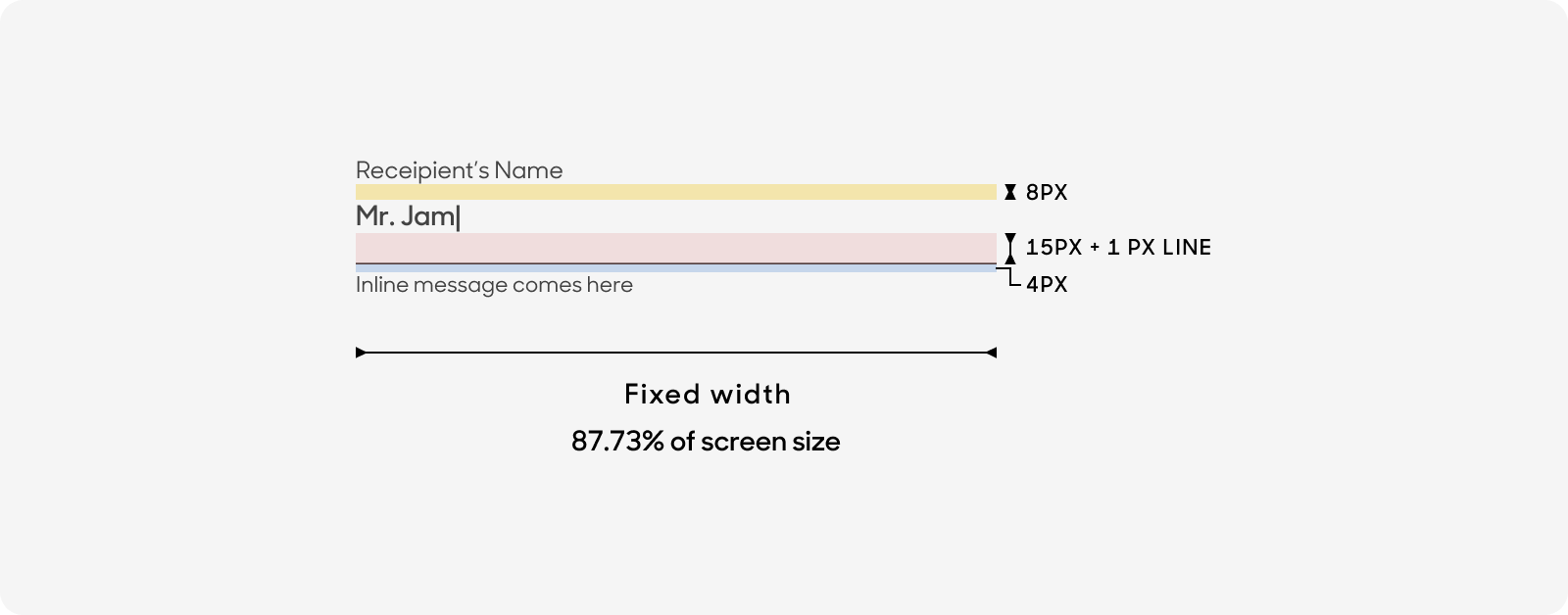
Textfield should have a fixed width (87.73% of screen size).
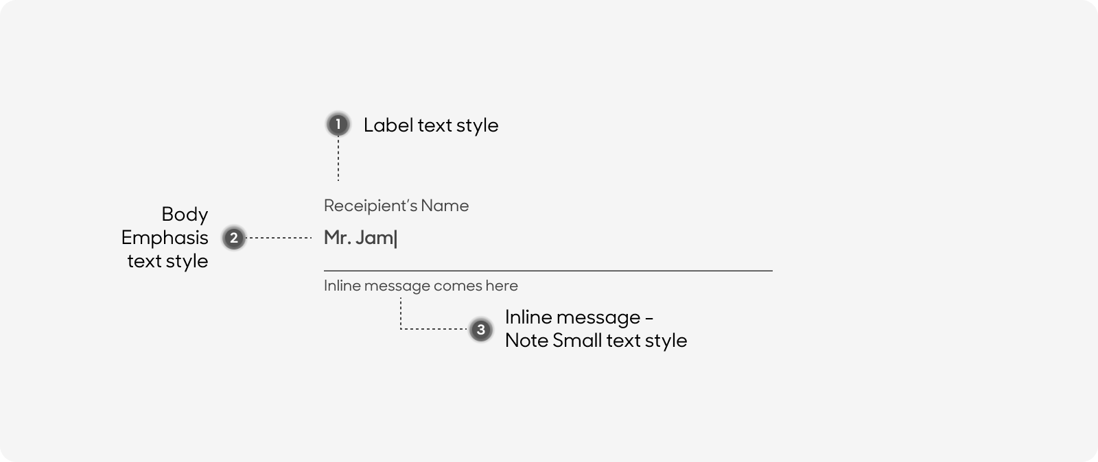
Text Style
All text labels in our buttons have the same text size
- Label size
- Title Case for Label (i.e. Click here, Sign up now).
- Use “label or note” text style on Figma.
- Inline message
- Sentence Case.
- Use “Note Small” text style on Figma.
- Body copy - Use body emphasis and black emphasis colour when in typing state.
Dos and Don'ts
Swap Inline message with Error message.
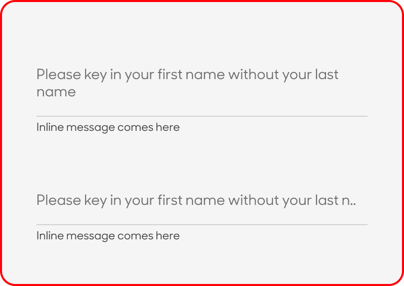
Truncate text labels.