Grid System
Our grid systems keep every Singlife digital interface responsive and fluid.
Breakpoints
| Device | Size (px) |
|---|---|
|
X-Large |
1200 and above |
|
Large |
1199 - 961 |
|
Tablet |
960 - 769 |
|
Mobile |
768 and below |
X-Large
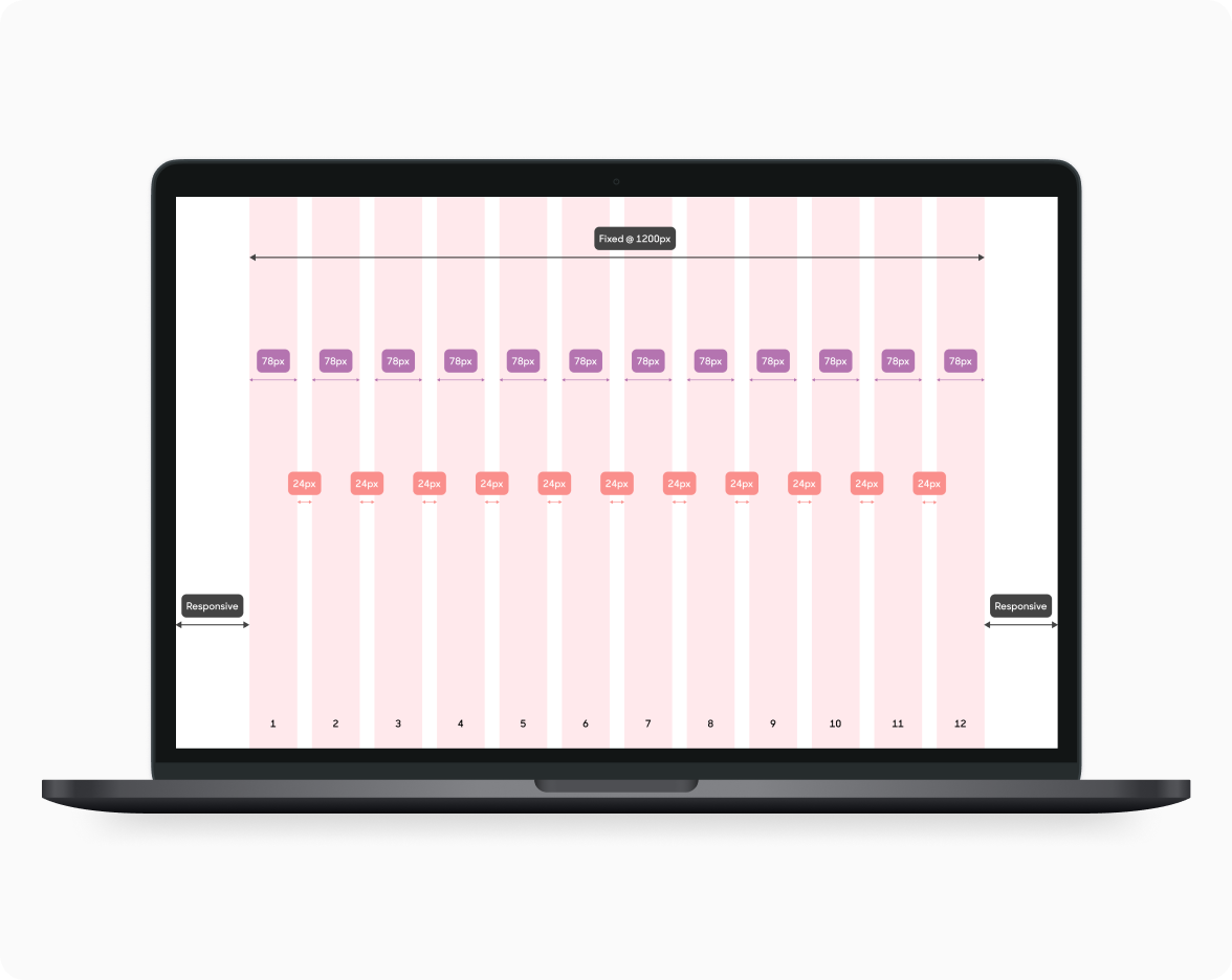
| Element | Value |
|---|---|
|
Device Size |
1200px (w) and above |
|
Columns |
12 |
|
Column Width |
78px |
|
Gutter Width |
24px |
|
Behavior |
Fixed. Width of all 12 columns: 1200px (does not grow). Only margin extends responsively. |
|
Figma Artboard |
We recommend using Desktop: 1440 x 1024 on Figma. |
Large

| Element | Value |
|---|---|
|
Device Size |
1199 - 961 px (w) |
|
Columns |
12 |
|
Column Width |
Responsive |
|
Margin Width |
24px |
|
Gutter Width |
24px |
|
Behavior |
Responsive or fluid. All column widths stretch while margin width is fixed and constant. |
Tablet
| Element | Value |
|---|---|
|
Device Size |
1199 - 961 px (w) |
|
Columns |
8 |
|
Column Width |
Responsive |
|
Gutter Width |
24px |
|
Margin Width |
24px |
|
Behavior |
Responsive or fluid. All column widths stretch while margin width is fixed and constant. |
Mobile
| Element | Value |
|---|---|
|
Device Size |
1199 - 961 px (w) |
|
Columns |
4 |
|
Column Width |
Responsive |
|
Margin Width |
24px |
|
Gutter Width |
16px |
|
Behavior |
Responsive or fluid. All column widths stretch while margin width is fixed and constant. |