Headers
Page headers define the top of a page. It provides an overview of the page content and may contain controls like tabs and buttons.
Variants
Gradient Headers
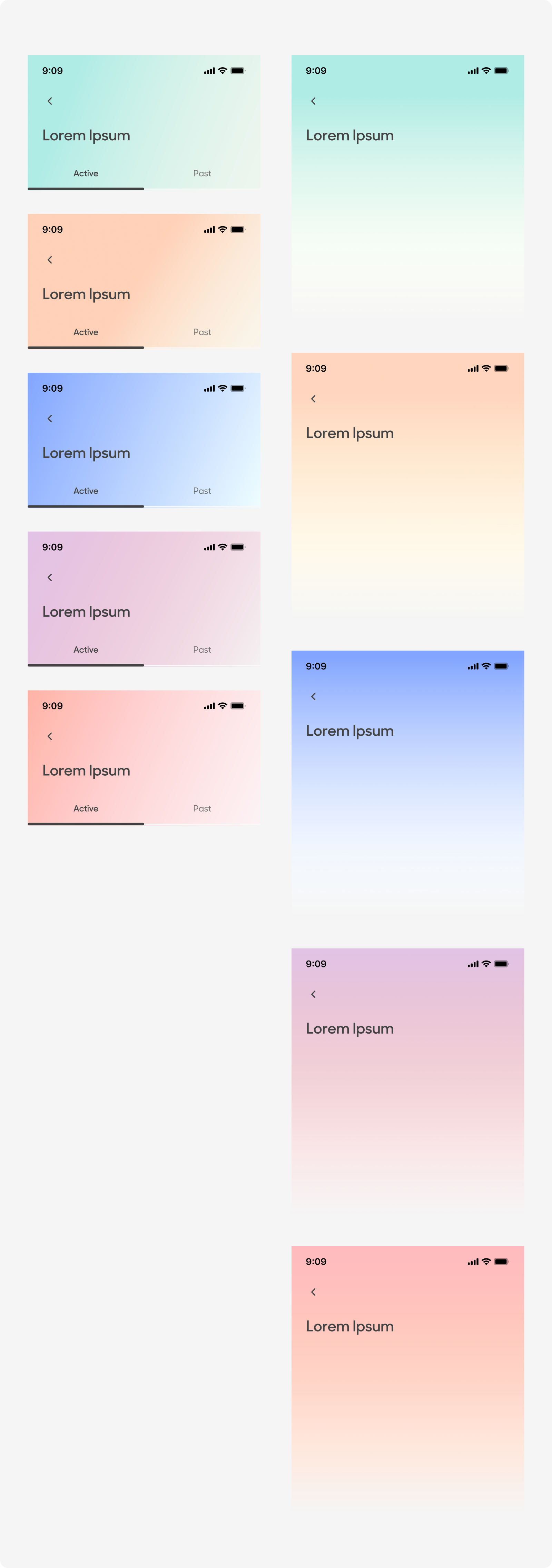
Collapsed Headers
| Variant | Usage |
|---|---|
|
Gradient Headers |
Header color coded according to its pillar. On load overview view of content |
|
Collapsed Headers |
Used for pages with short headers |
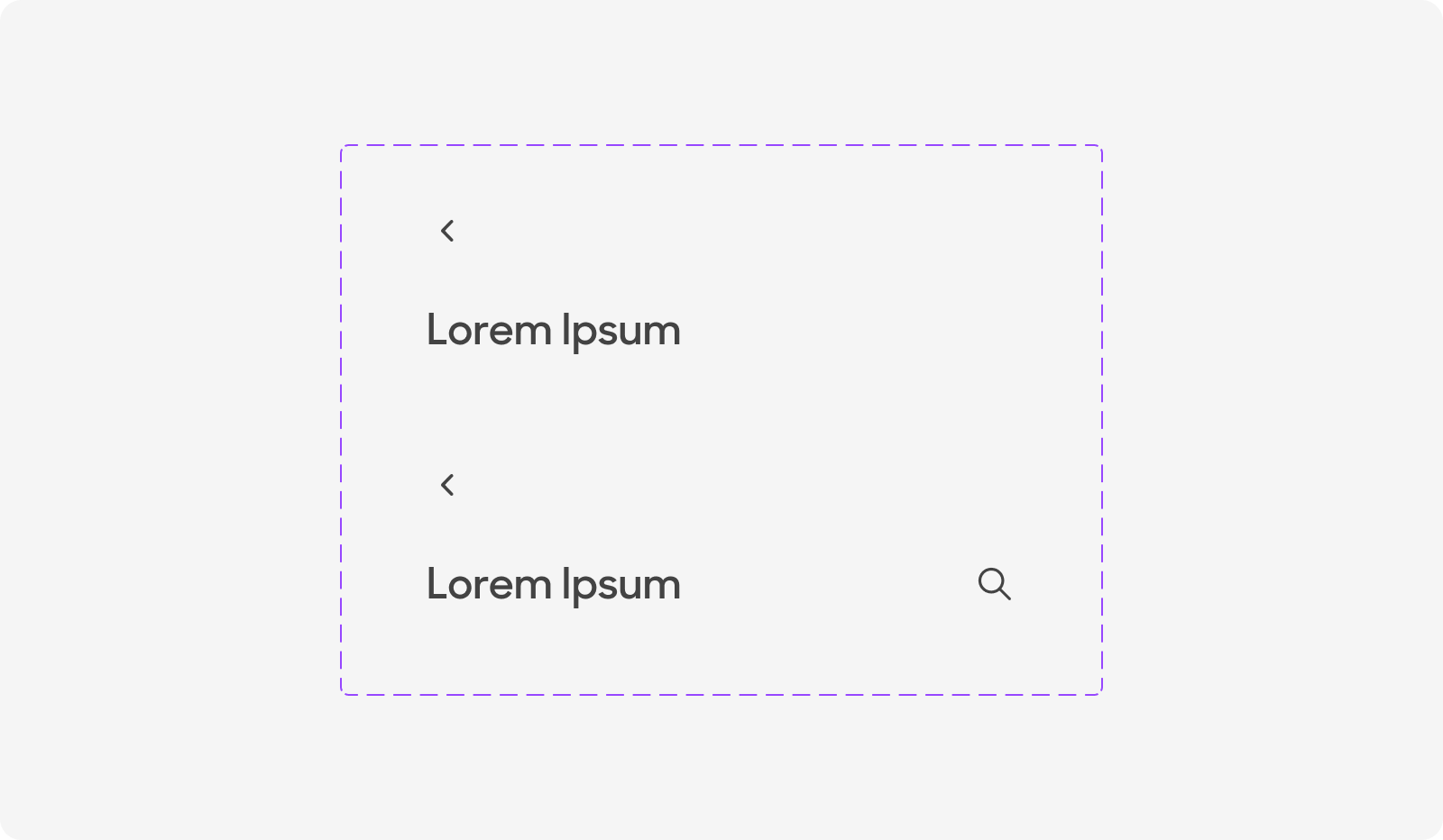
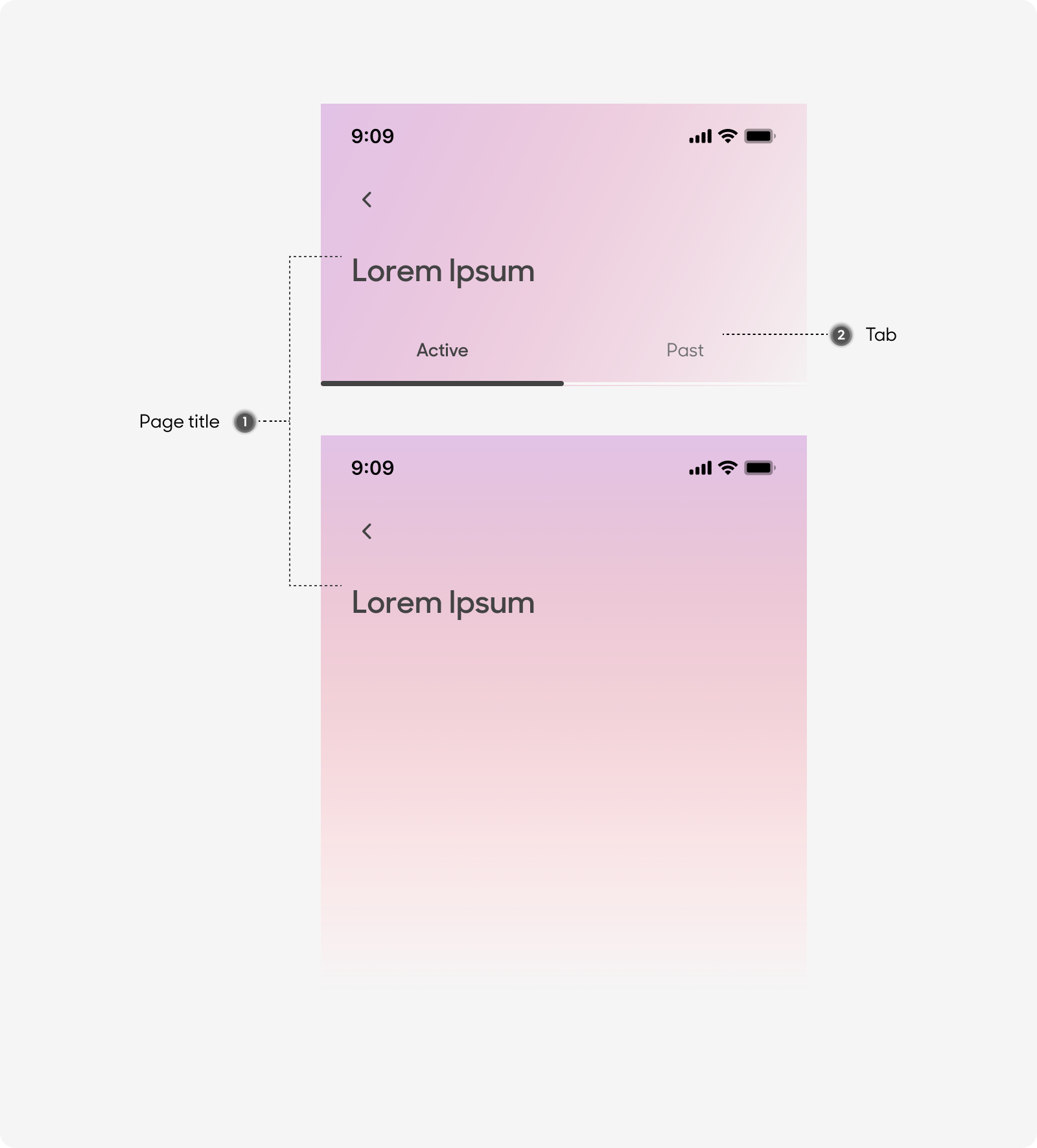
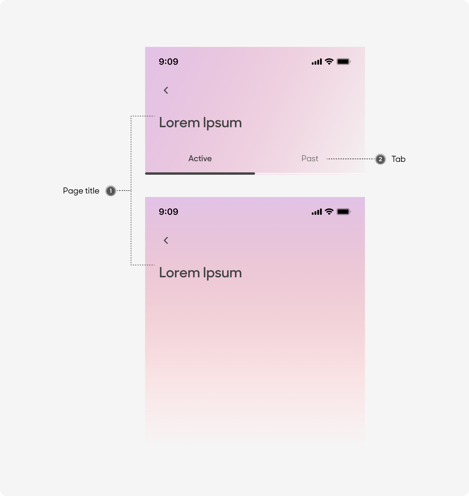
Anatomy
Headers are made up of the following:
- Page Title
- Tab
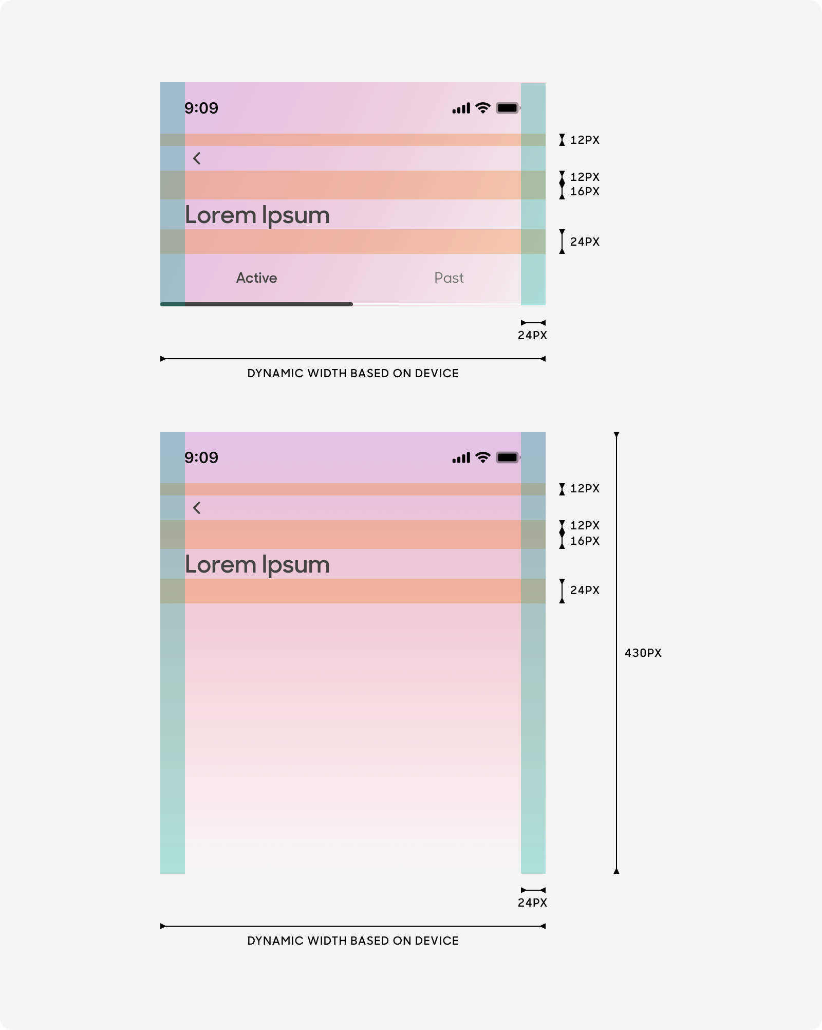
Size
Drawers have an overall padding of 24px, and its width depends on the length of the content it has.
Text Style
- Page Title: Uses “Display (Default)” text style on Figma
- Primary Grey color
- Tab
- Active Tab
- Uses “Body Emphasis” text style on Figma
- Primary Grey Color
- Inactive Tab
- Uses “Body (Default)” text style on Figma
- Inactive Grey color
- Active Tab
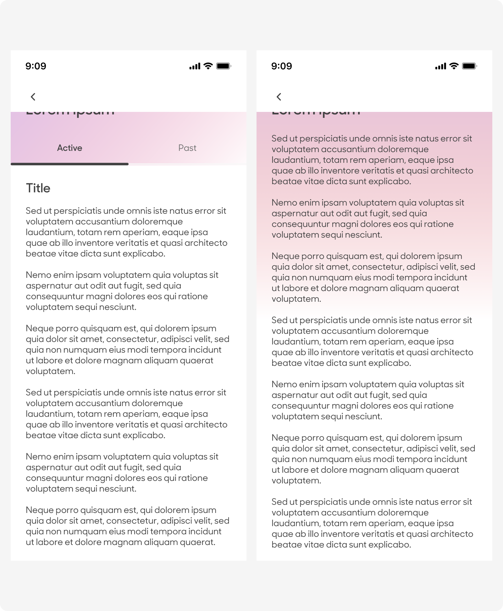
Behavior
Header with /without tabs
Status and page title bar change from gradient to white upon scrolling up
Dos and Don'ts
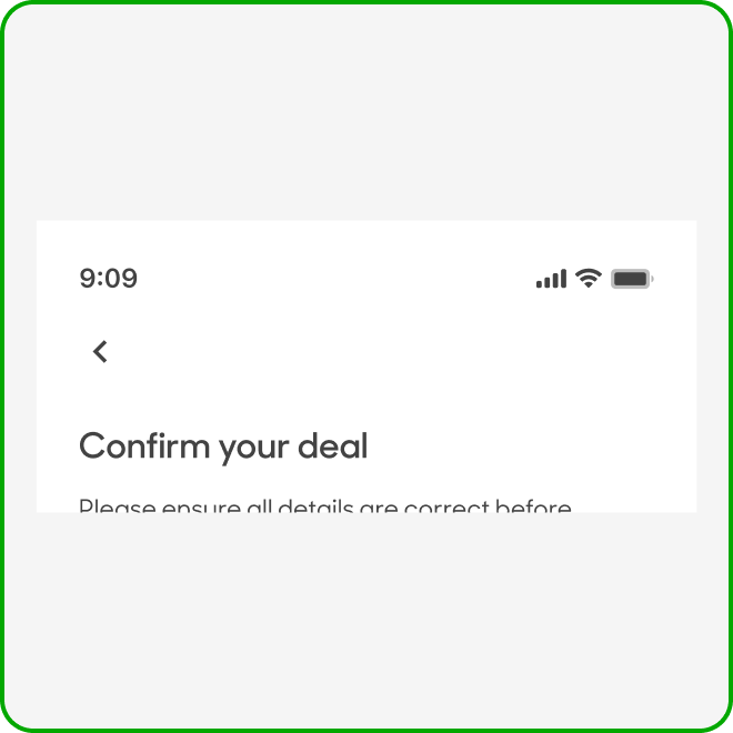
(Before scrolling up)
Leave page title bar empty if there’s no alternative wording from section title.
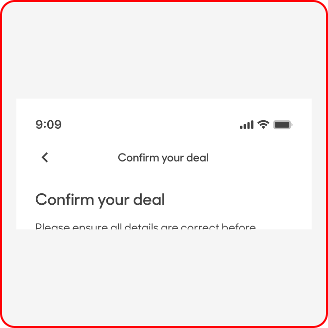
(Before scrolling up)
Avoid repeating copy in page title bar on section title.