Drawers
Drawers provides contextual information and selections
while keeping the main page in view.
Variants
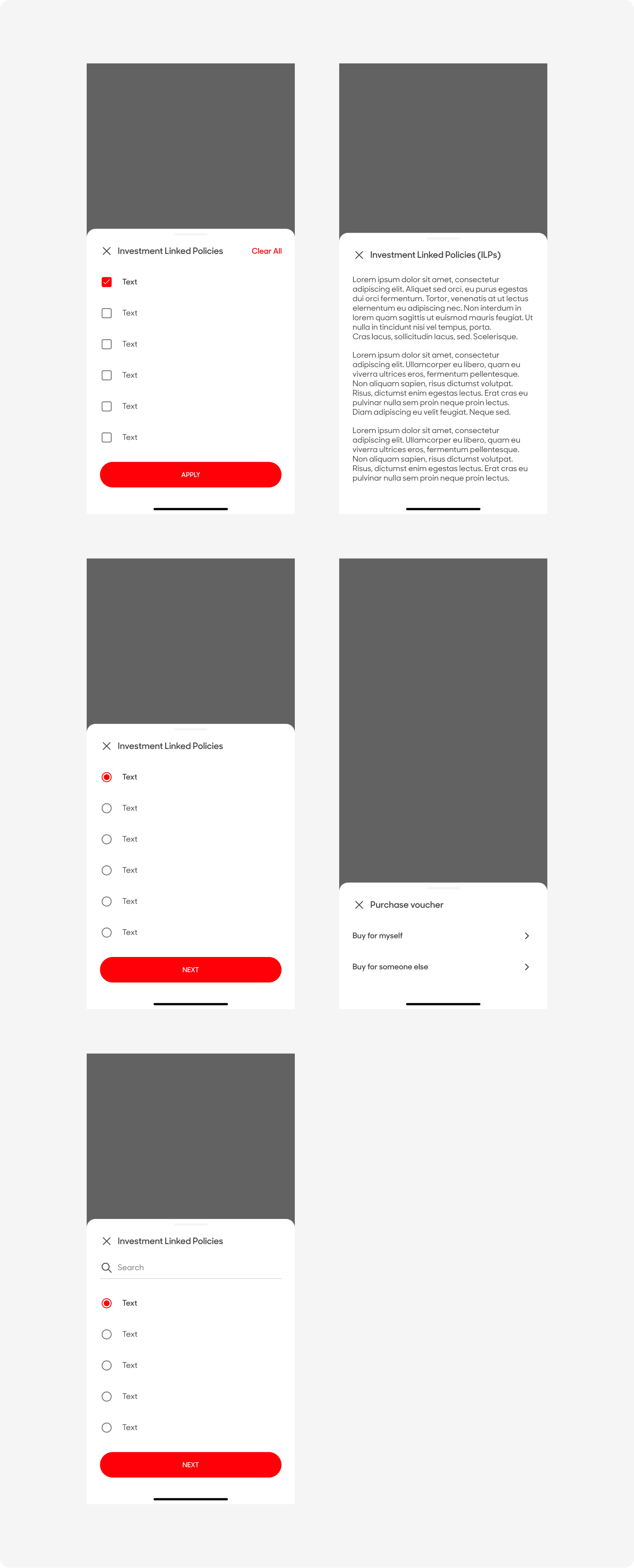
| Variant | Usage |
|---|---|
|
Drawer with Checkbox |
Used when users are allowed to select multiple options |
|
Drawer with Text |
Used to display text regarding information relevant to the parent page |
|
Drawer with Radio |
Used when users are only allowed to select one option |
|
Drawer with List |
Used when user can launch an action from a single selection |
|
Drawer with Search |
Used when the user can filter through available options to select one or multiple |
Anatomy & Sizes
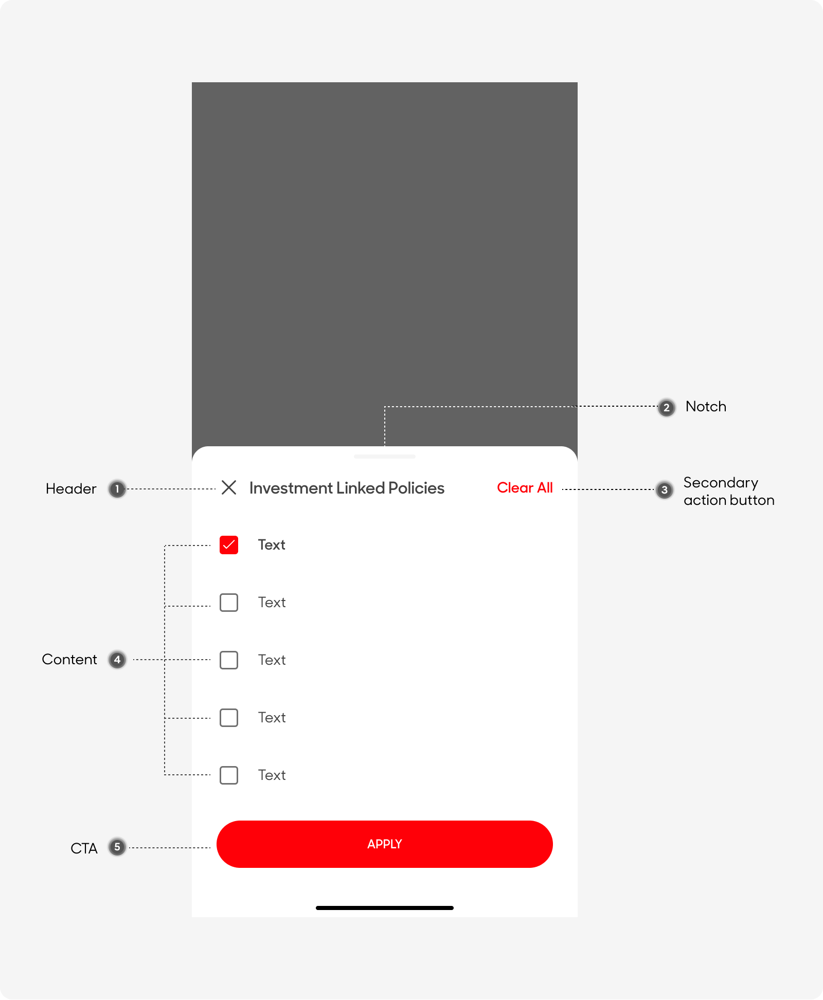
Inbox cards are made up of the following:
- Card Title
- Section Title
- Body Copy
- Notes
- Dot (Separator)
- Chevron
- Activity Alert
- Container
Size
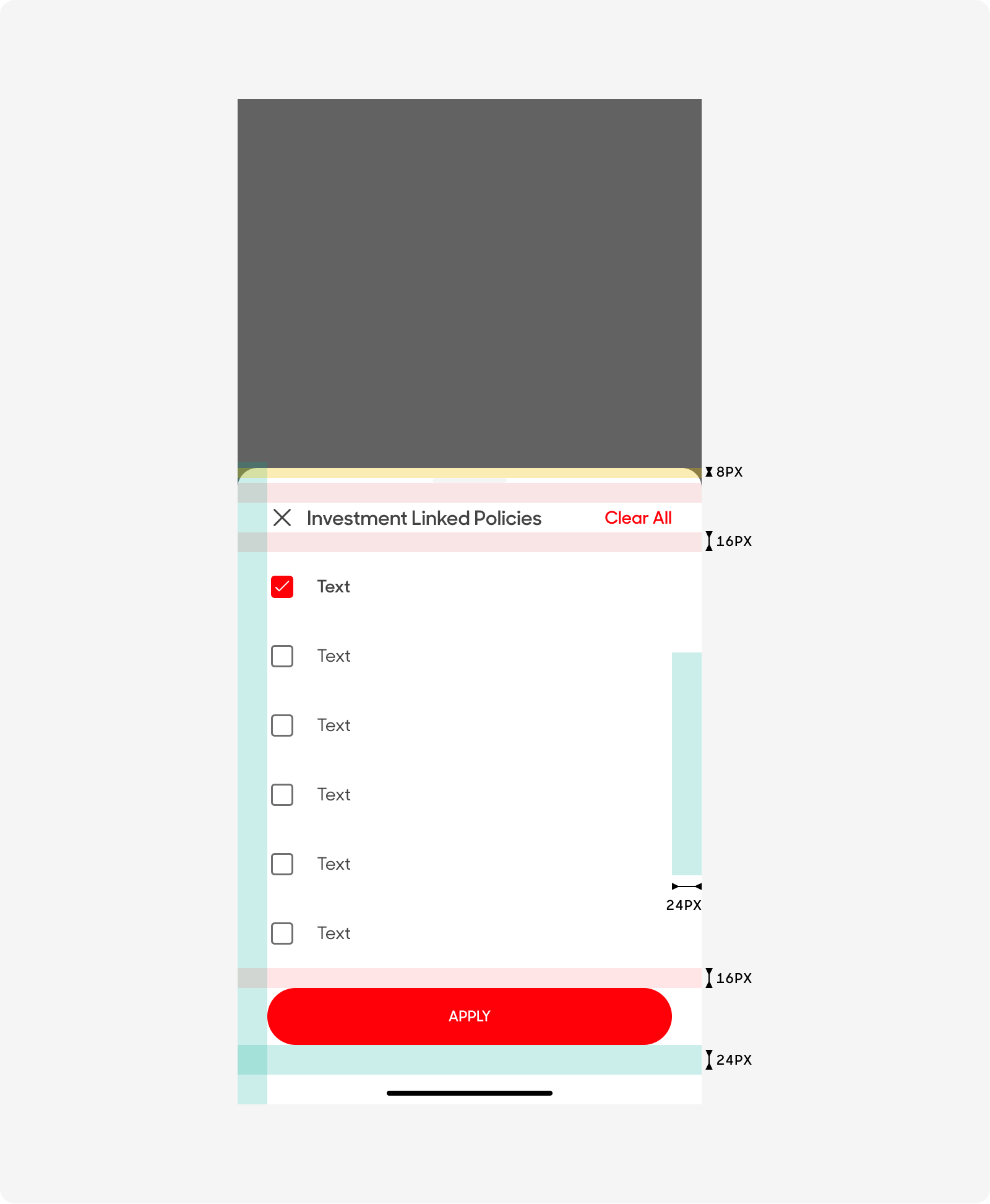
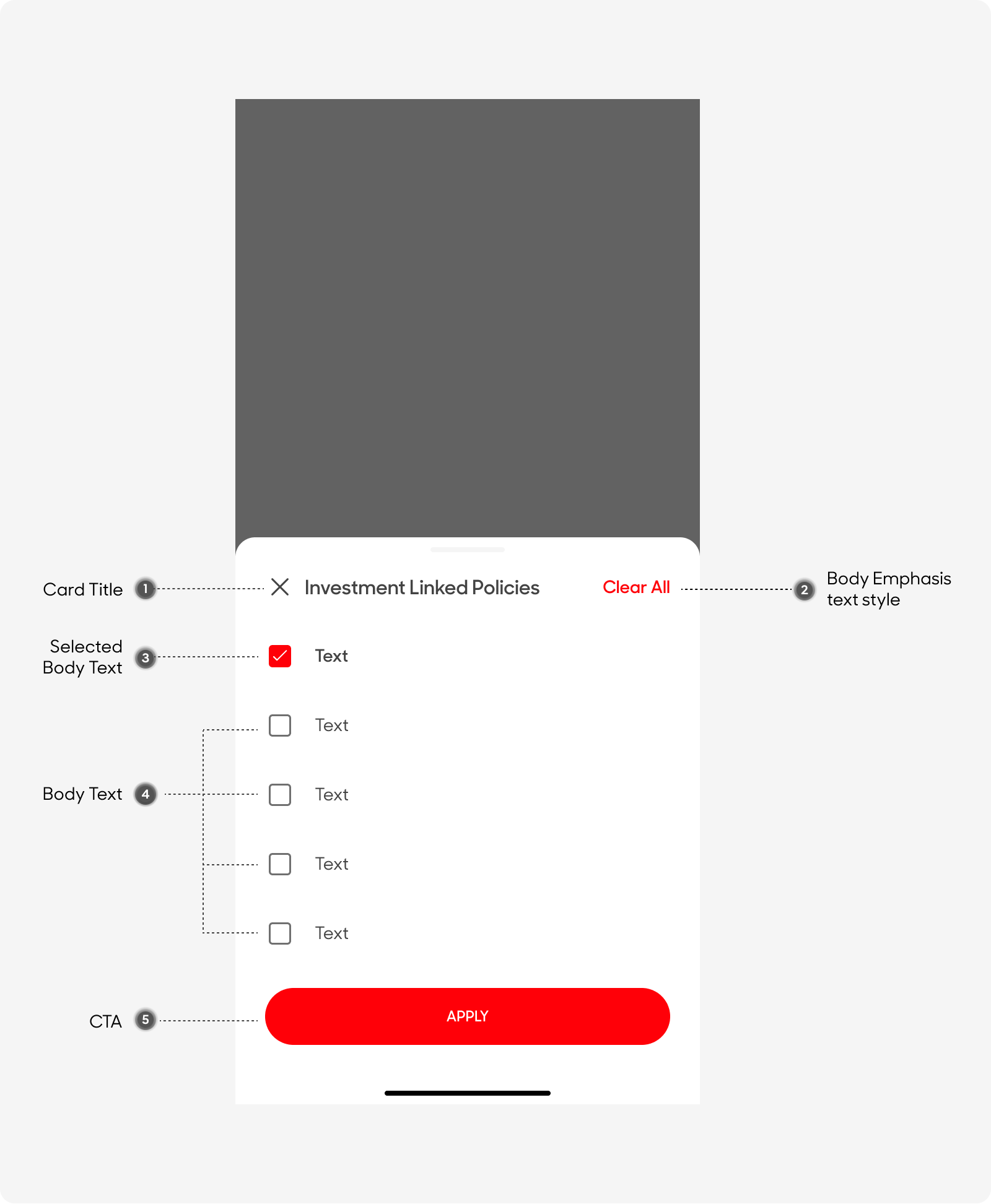
Drawers have an overall padding of 24px, and its width depends on the length of the content it has.
Text Style
- Card Title: Uses “Card Title” text style on Figma
- Primary Grey color
- Secondary Action Button
- Use “Body (Emphasis)” text style on Figma
- Singlife Red Color
- Body Copy
- Uses “Body” text style on Figma
- Primary Grey color
- Selected Body Content
- Use “Body (Emphasis)” text style on Figma
- Primary Grey color
- Call-to-Action Button
- Use “CTA” text style on Figma
- Uppercase
Behavior
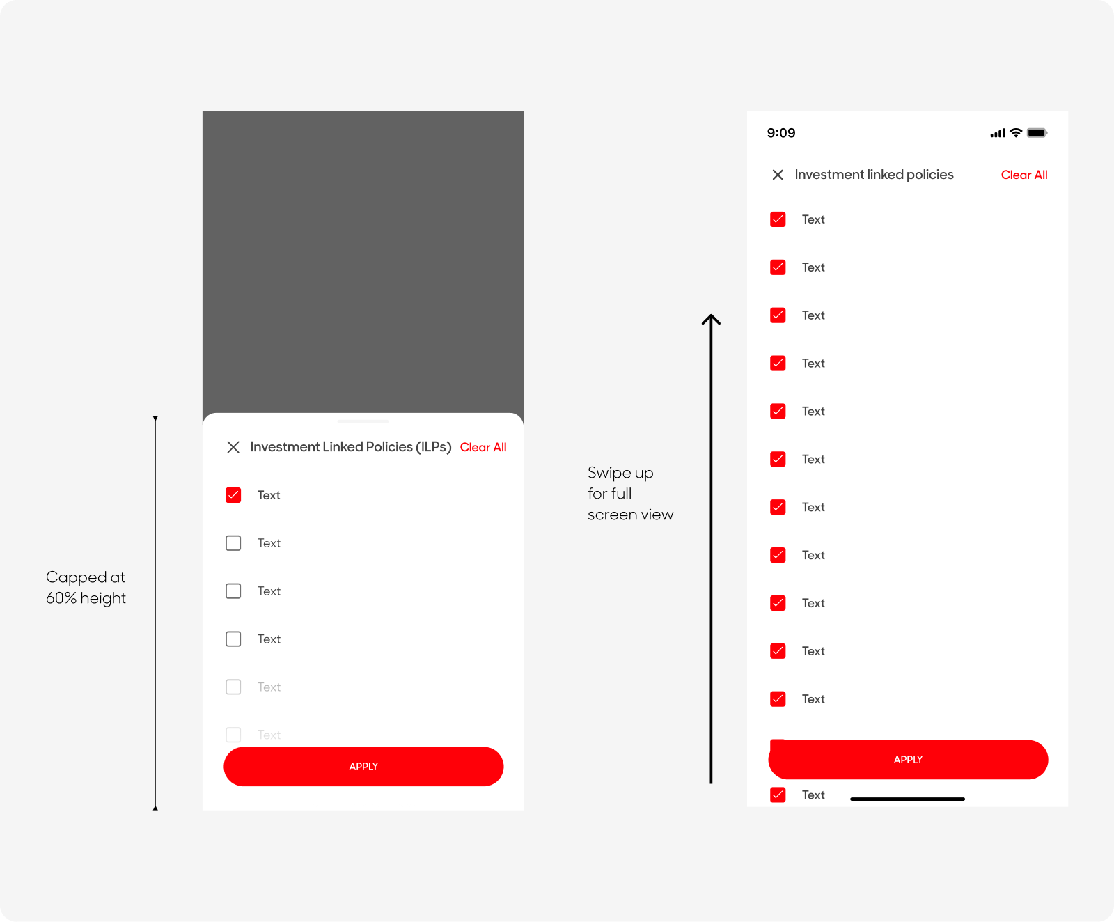
Modal Drawers should be dynamic, capped at 60% of the screen height. Drawers whose contents exceed 60% of the screen height can then be pulled across the full screen, scrolling internally to access their remaining items.
Dos and Don'ts

