Filters
Filters allows a user to narrow down visible items when browsing through large data sets.
Variants

| Variant | Usage |
|---|---|
|
Filter |
Used to indicate filter that has been applied to selection |
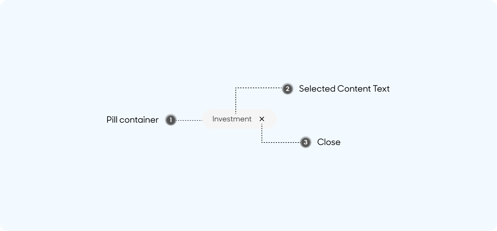
Anatomy
Filter Tabs are made up of the following:
- Pill container
- Selected Content Text
- Close Button
Size
Filters have a padding of 8px overall, except for a left and right padding of 16px
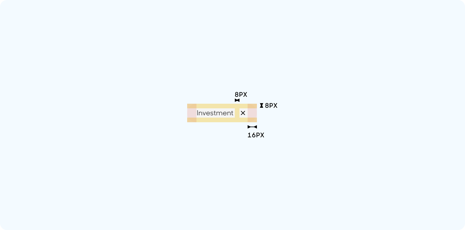
Text Style
- Selected Content text uses “Label or Note” text style in Figma
- Primary Grey Color

Behavior
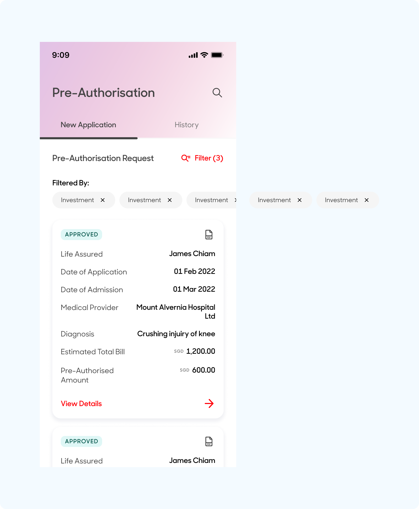
To be used together with icon and text button. Buttons should be stacked side by side. Tap to close and remove the selected filter.
Dos and Don'ts
Include no. of filters selected beside text link, and use the filter together with a drawer to allow customers to place a selection

Fit multiple filter results within the screen