Cards (Single Product)
Cards are containers that group related information and action
about a single subject.
Variants
Single Product
| Variant | Usage |
|---|---|
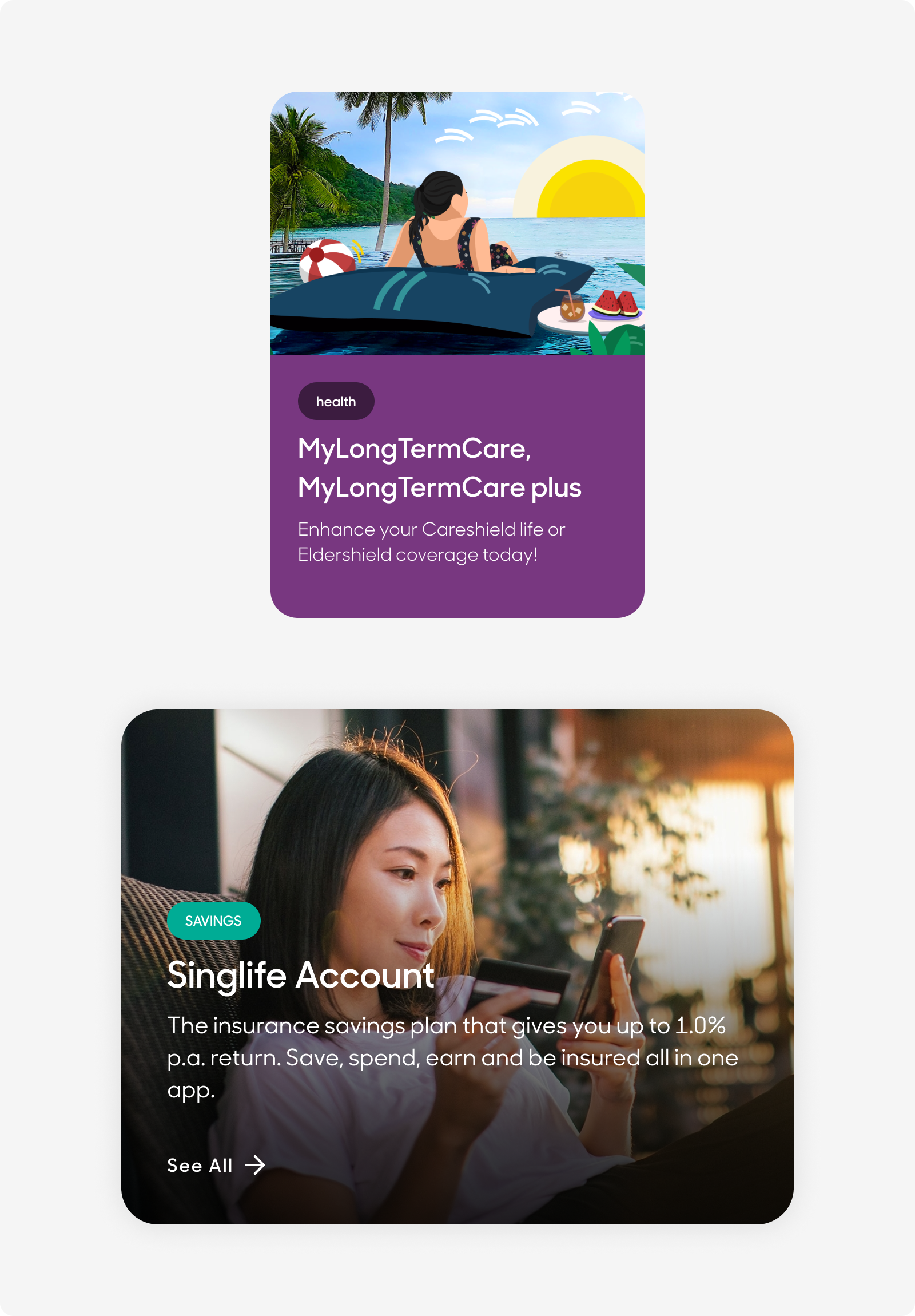
|
Product Overview |
These cards hold overview information about a single product, and presents bite size information to summarize the product’s overall benefits. |
|
Product Overview |
These cards presents the type of category a single product falls in, and a single liner describing the product. |
Anatomy
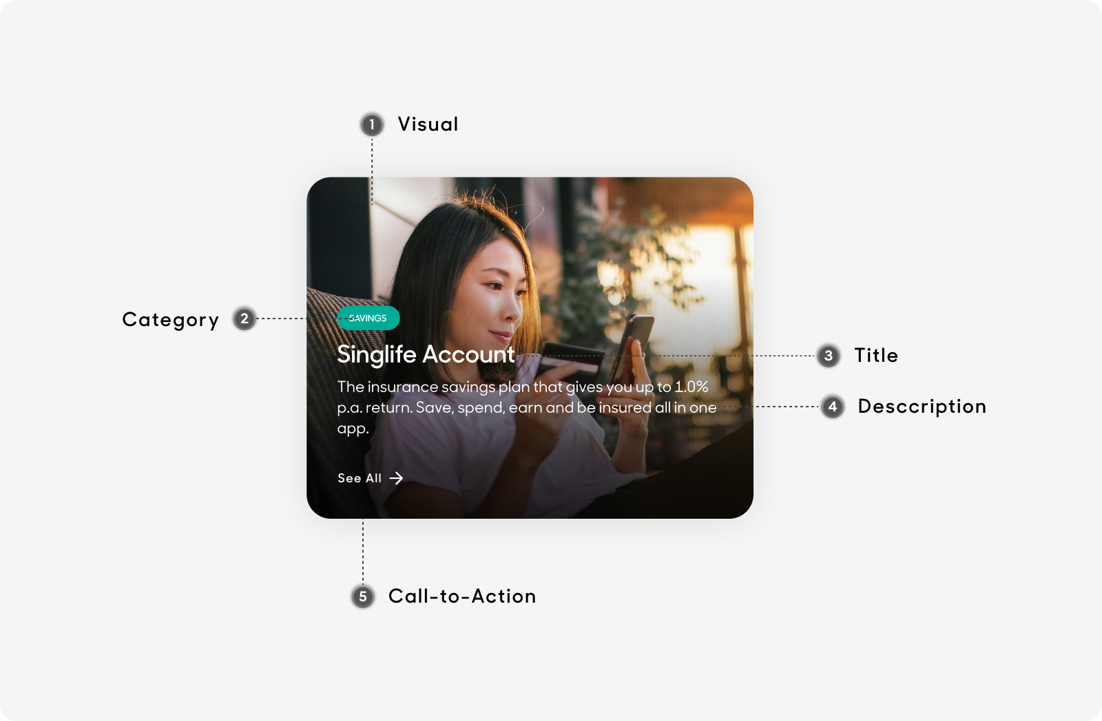
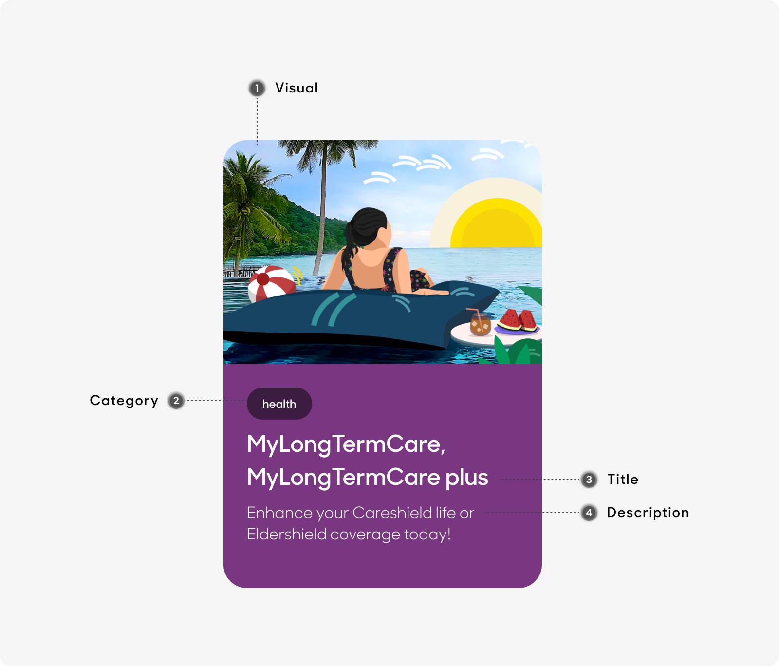
Single Product Cards are made up of the following:
- Visual: Image content to visualize and represent the product.
- Category: Categories which are covered under the product.
- Title: Name of product.
- Description: Short description of product.
- Call-to-Action (Desktop Only): Redirects user to relevant product page.
Desktop
Mobile
Size
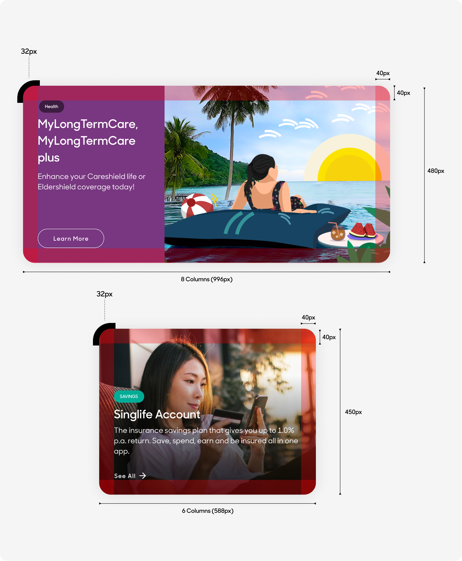
- Desktop:
- Stretches across 8 columns (996px) on desktop grid system, 480px in height with 40px padding.
- Stretches across 6 columns (588px) on desktop grid system, 450px in height with 40px padding.
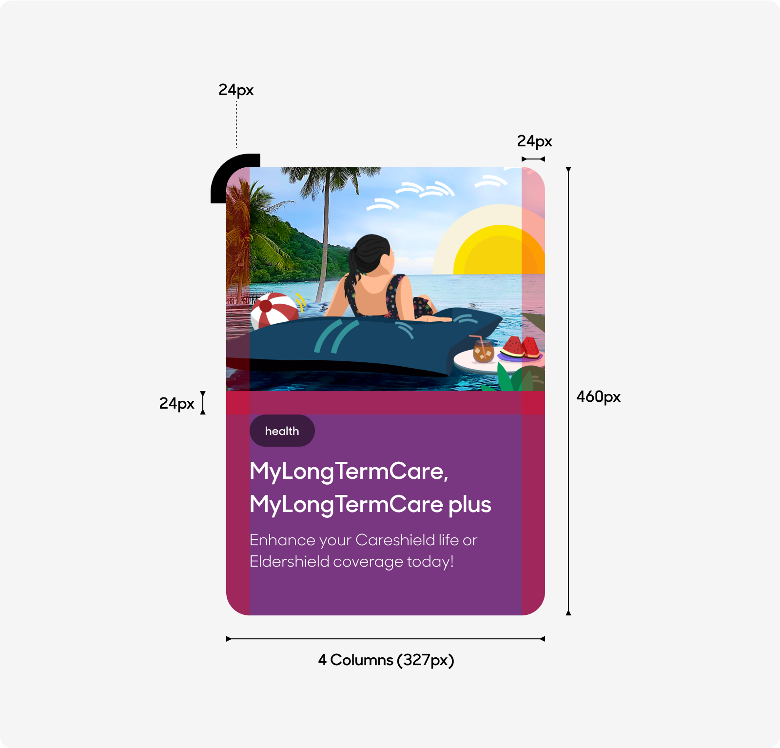
- Mobile:
- Stretches across 4 columns (327px) on mobile grid system, 460px in height with 24px padding.
Desktop
Mobile
Text Style
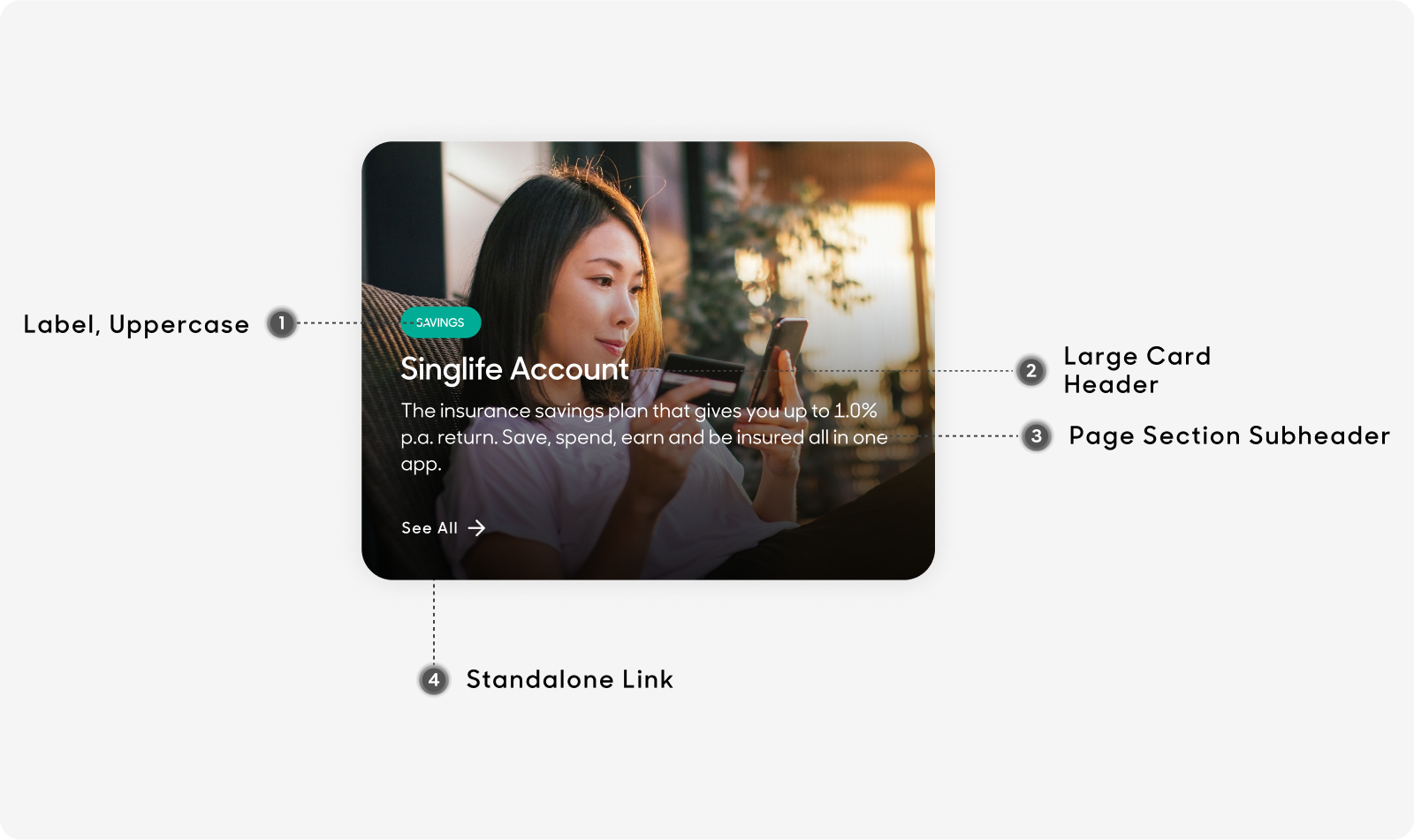
Desktop
- Label follows "Label” text style.
- Header text size at 32px, use “Card-Large Header/H2_semibold” text style on Figma.
- Card body text size at 20px, use “Page Section-Sub Header/H4_medium” in Figma's text styles for card body content text.
- Standalone link follows the text styles of "Standalone Link".
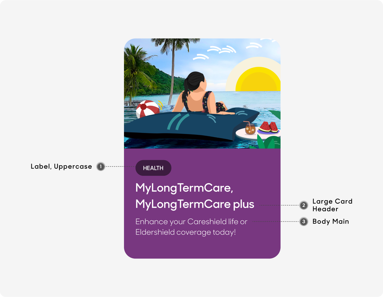
Mobile
- Label follows "Label” text style.
- Header text size at 24px, use “Card-Large Header/H2_semibold” text style on Figma.
- Card body text size at 16px, use “Body/Main” text style on Figma for card body content text.
Dos and Don'ts
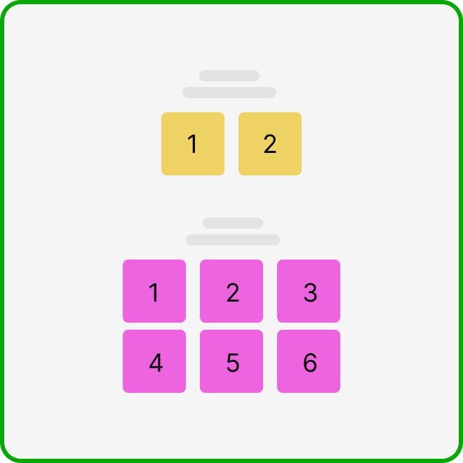
Ensure that you have at least 2 and up to a maximum of 6 cards when using this type of card.
Do not use this design type of card if you only have enough content for 1.