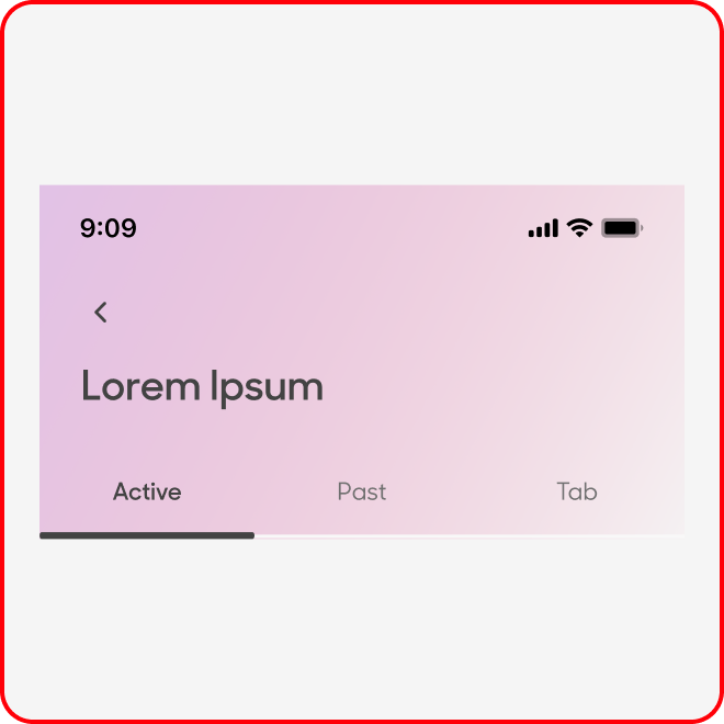
Tabs
Tabs are used to toggle between sub menu items within the
same page.
Variants
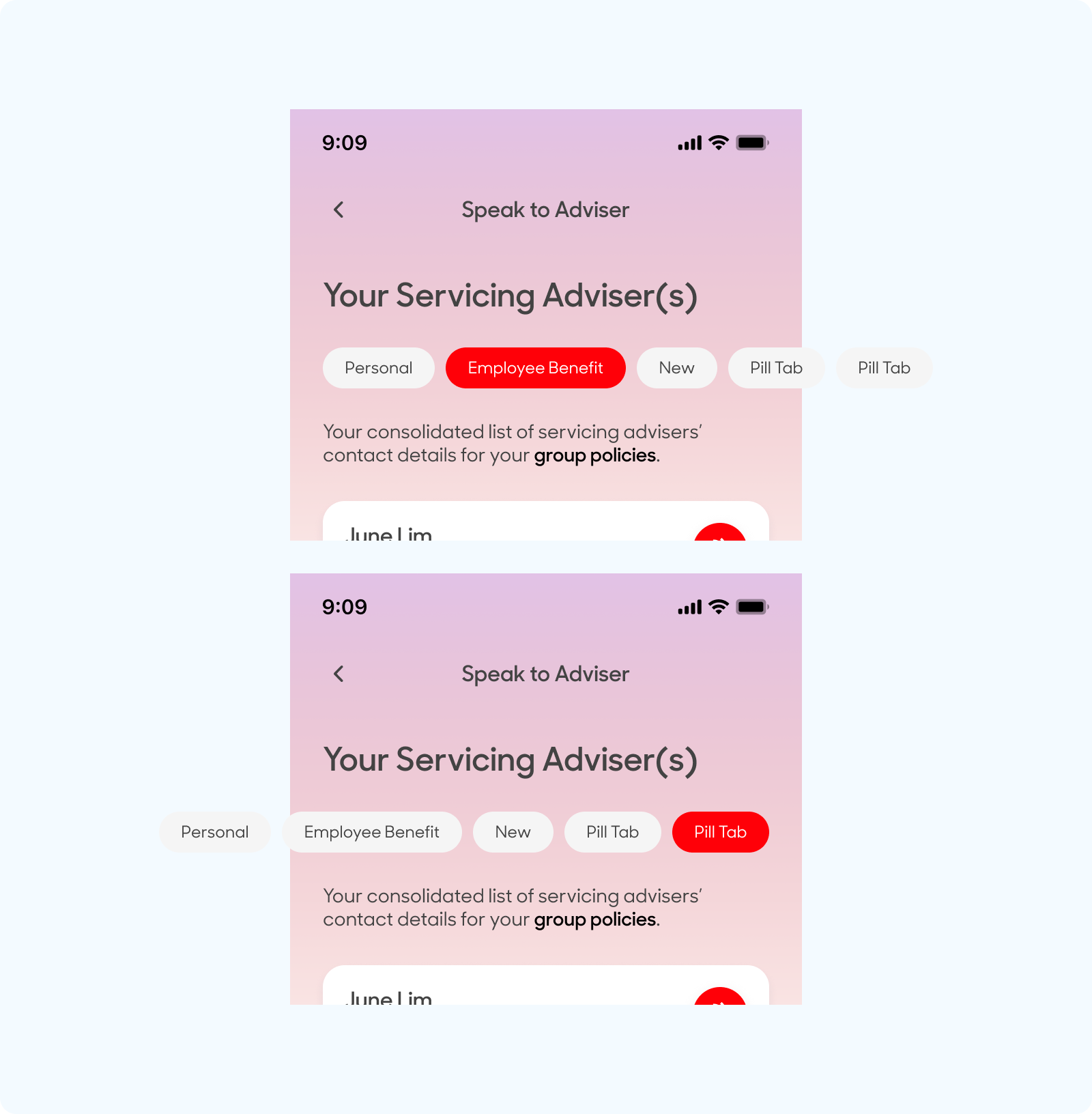
Pill Tabs

Pill Tabs with Icons

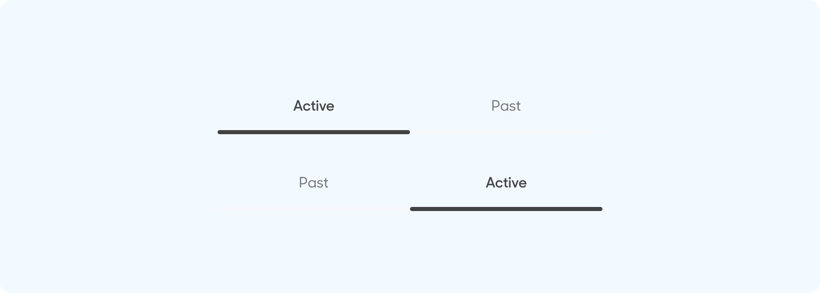
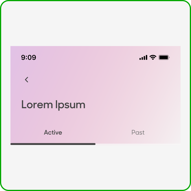
Text Tabs

Tabs
| Variant | Usage |
|---|---|
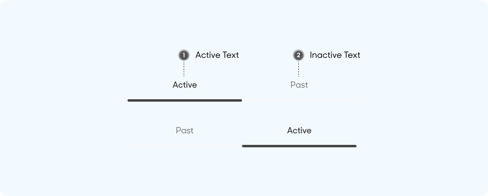
|
Active |
When the tab is selected and active |
|
Inactive |
When the tab is inactive |
Anatomy & Sizes
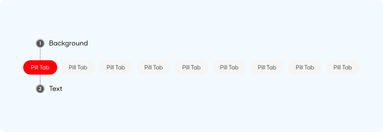
Pill Tabs
Pills are made up of the following:
- Background
- Text
- Icon (If applicable)
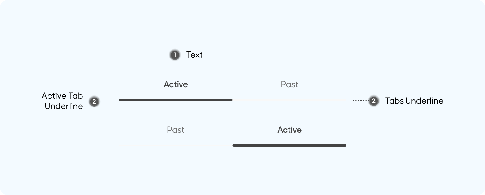
Text Tabs
Text Tabs are made up of the following:
- Text
- Active Tab Underline
- Overall Tabs Underline
Size
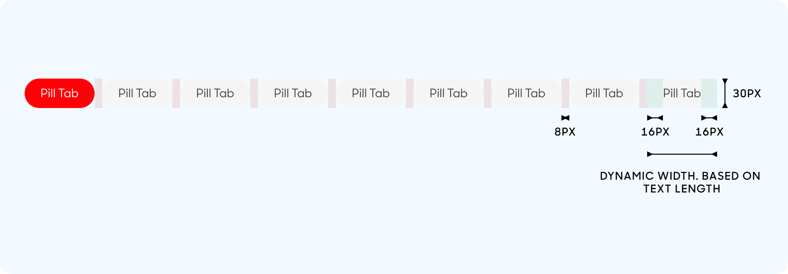
Pill Tabs
- Pill tabs have a padding of 16px and an 8px spacing between each pill tab.
- Pill tabs have a width that is dynamic which is based off the length of its text.
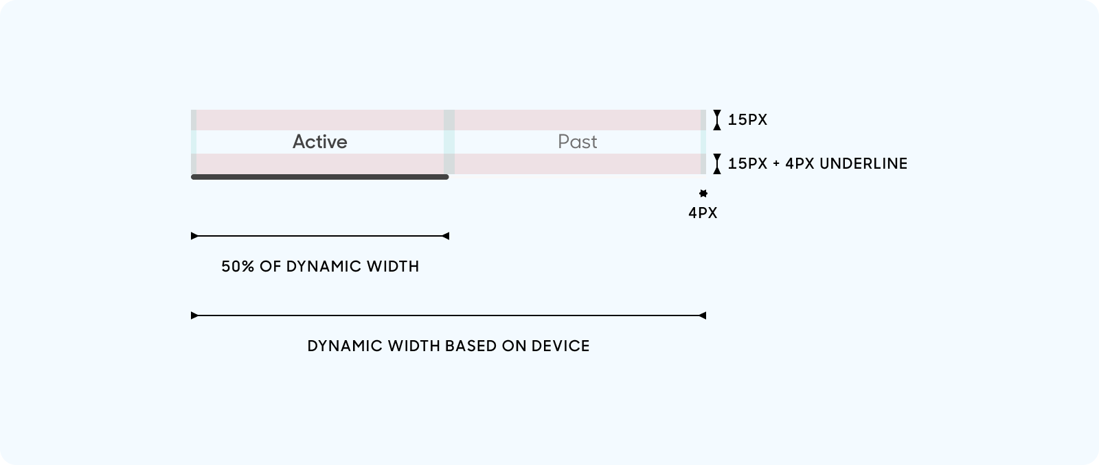
Text Tabs
- Text tabs have a top and bottom padding of 15px
- Text tabls have a left and right padding of 4px
- The underline of text tabs are 2px
- The underline of active text tabs are 4px
- Text tabs have a dynamic width that is based on the device size, where each individual tab will take up 50% of the entire width
Text Style
Pill Tab
- Pill Text
- Use “Body (Default)” text style on Figma.

Text Tab
- Active Tab text
- Use “Body (Emphasis)” text style on Figma
- Primary Gray color
- Inactive Tab text
- Use “Body (Default)” text style on Figma
- Inactive Gray color
Behavior
Pill Tab
Scrollable (horizontally) if it exceeds screen width.
Dos and Don'ts
Use underline tab when there are only 2 options, and use pill tabs when there are more than 2 options or if you envision there would be more options included in the future.
Avoid using underline tab if there are more than 2 options.