Accordions
Accordions nest large amounts of content and categorises them through progressive disclosure. The subject title gives the user an overview of the preceding content, allowing them to discern and decide the content which they want to engage in.
Variants
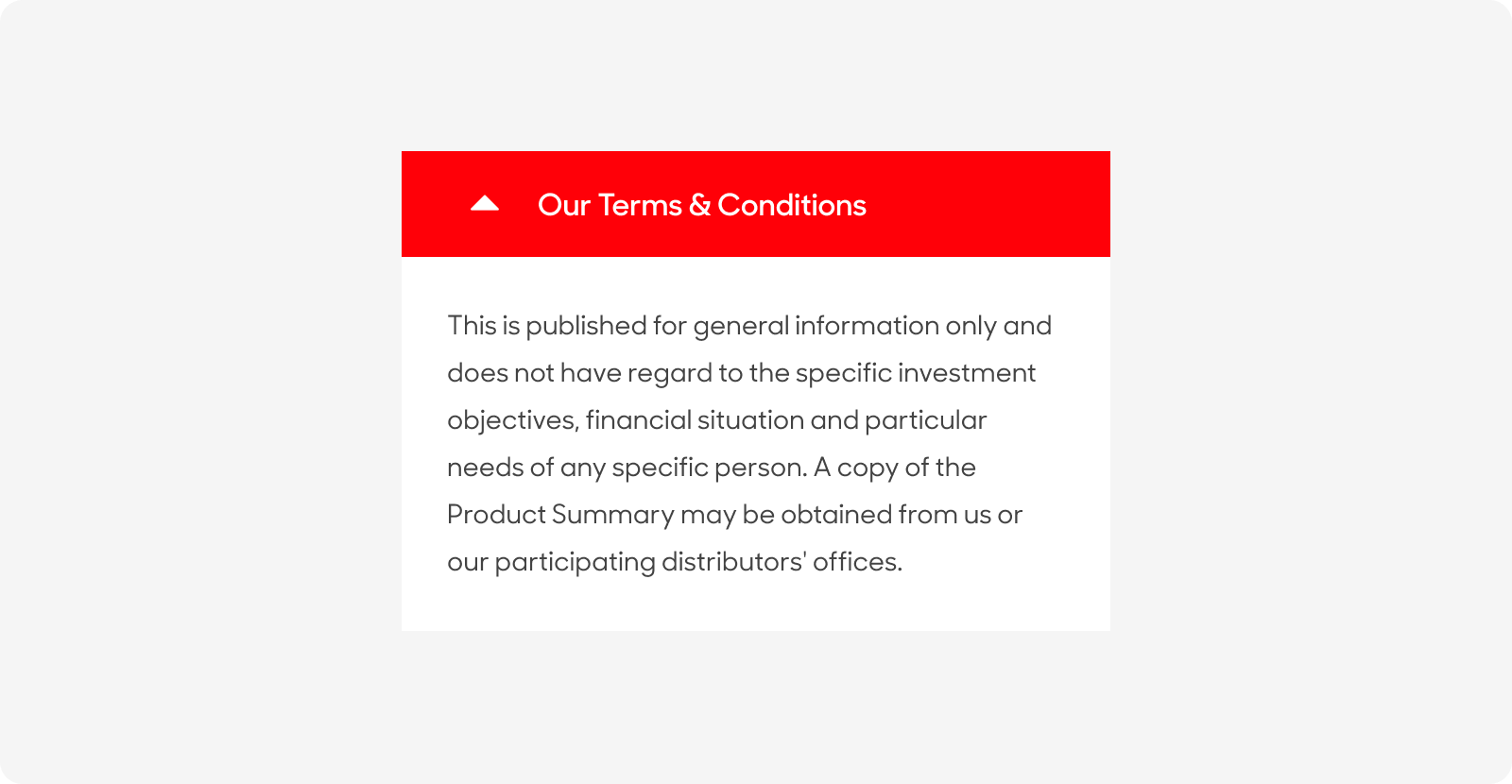
Accordions with Color
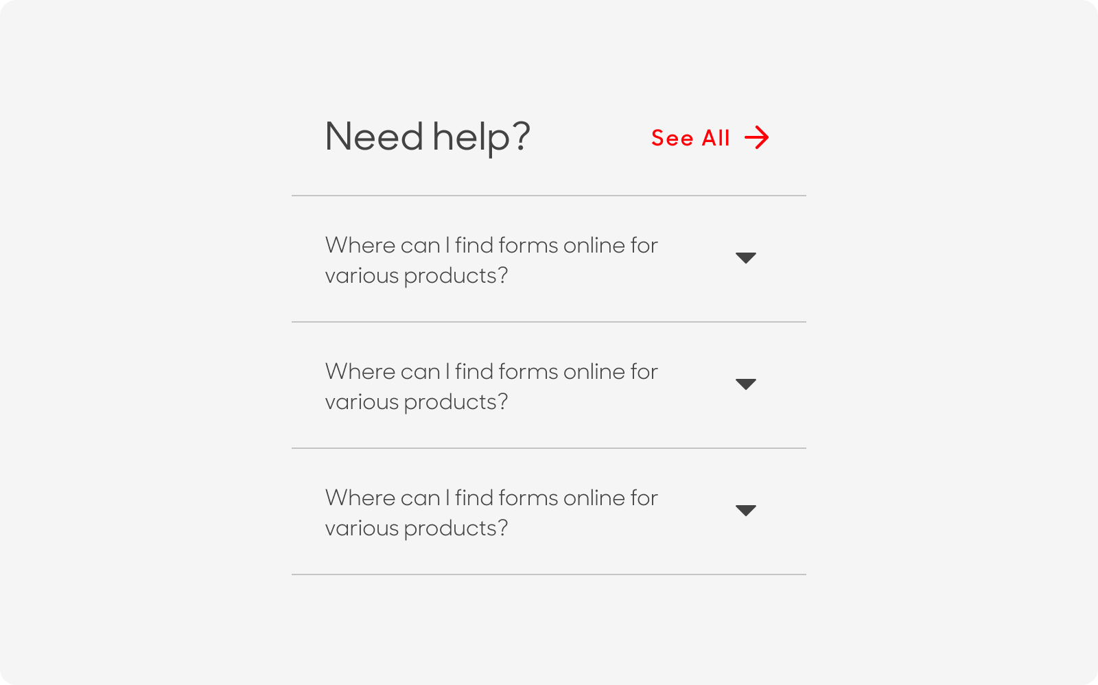
Accordions without Color
| Variant | Usage |
|---|---|
|
Accordions with Color |
These are mostly used when there is a huge chunk of information nested within the accordion, i.e. Terms and Conditions and disclaimers |
|
Accordions without Color |
These are used mostly when there are multiple sections of information for the user to expand. |
Anatomy
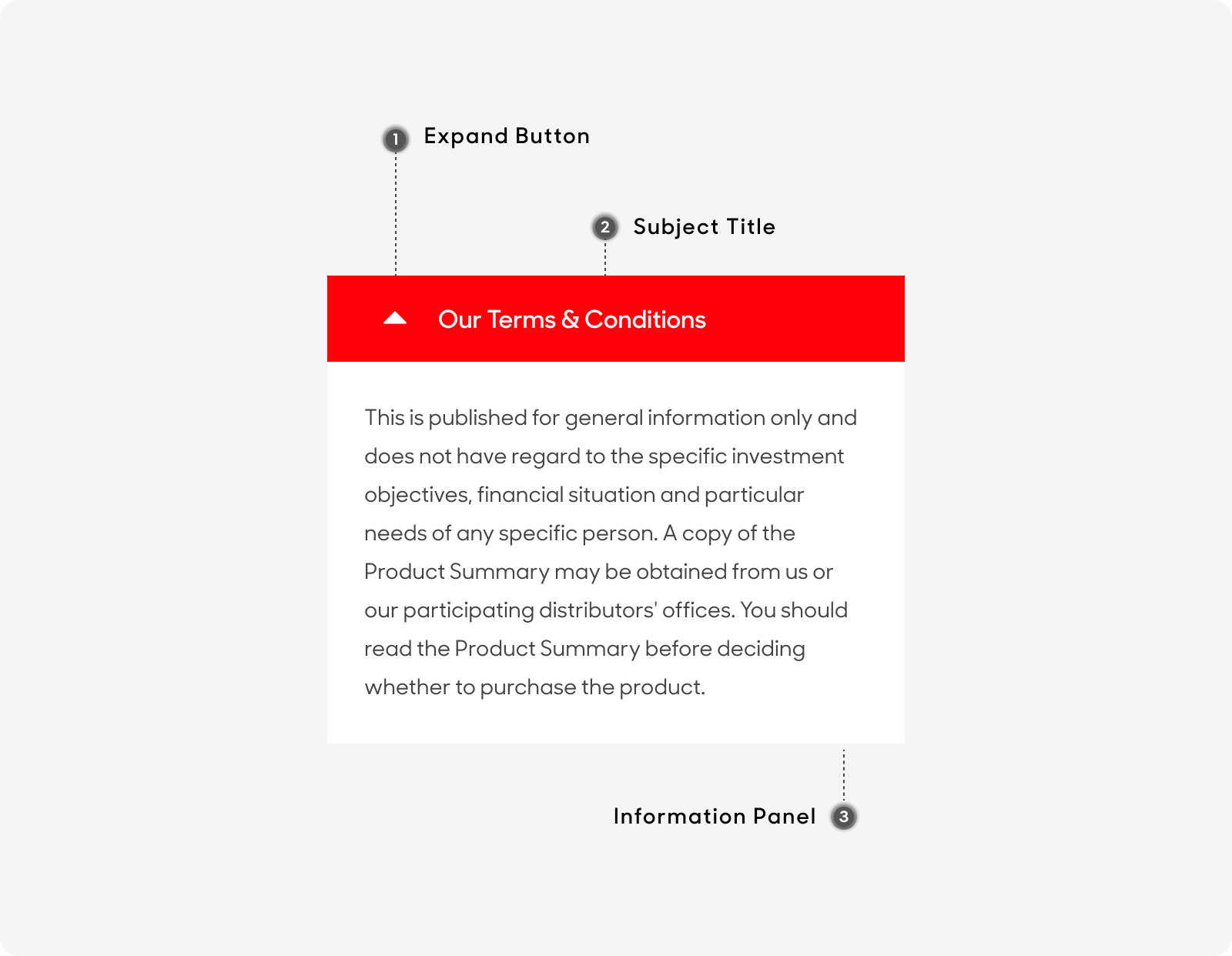
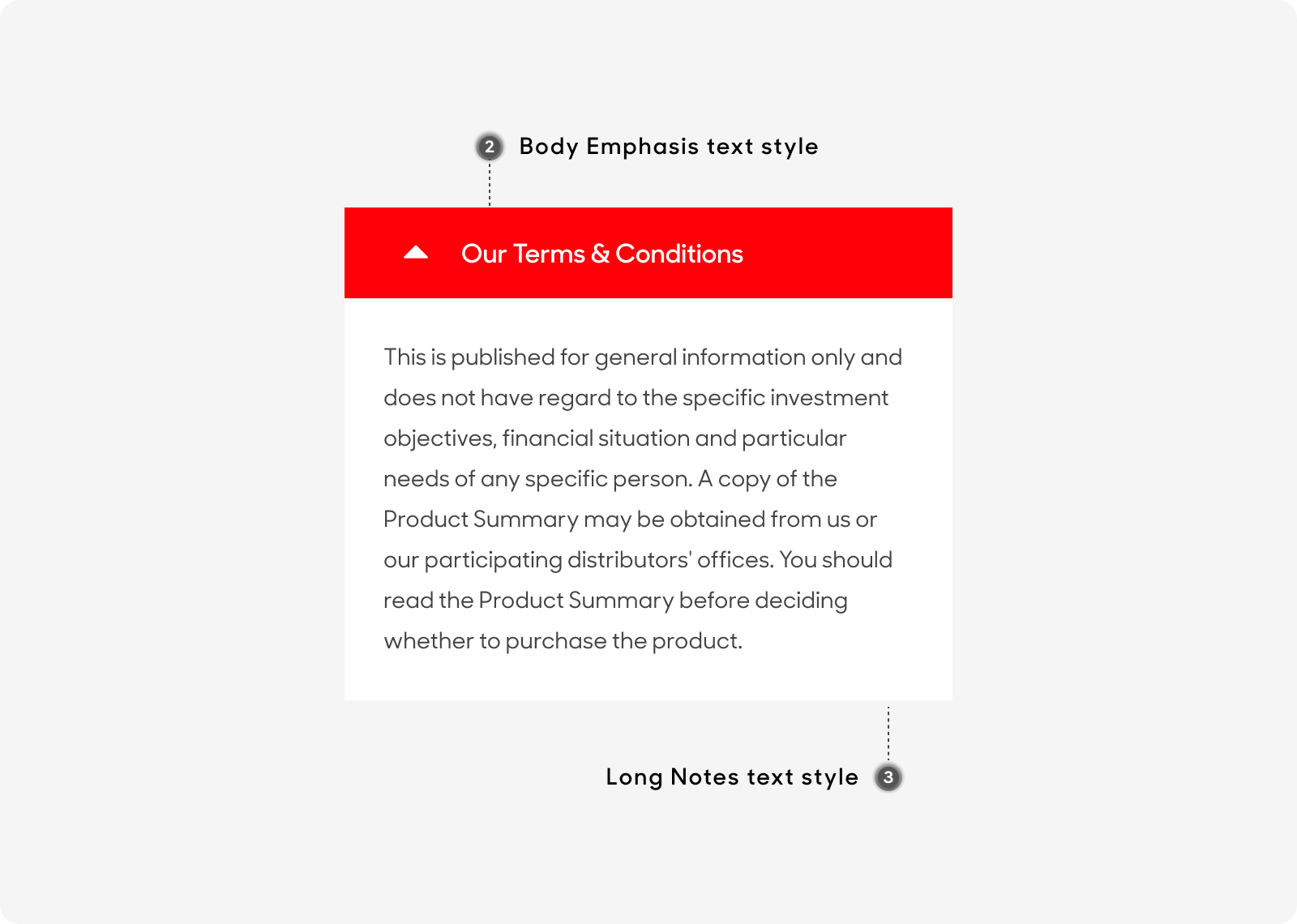
Accordions with color
Accordions with color are made up of the following:
- Expand Button: To expand and collapse the Dropdown.
- Subject Title: Overview title of Dropdown List.
- Information Panel: Panel of text content associated with the Dropdown List subject.
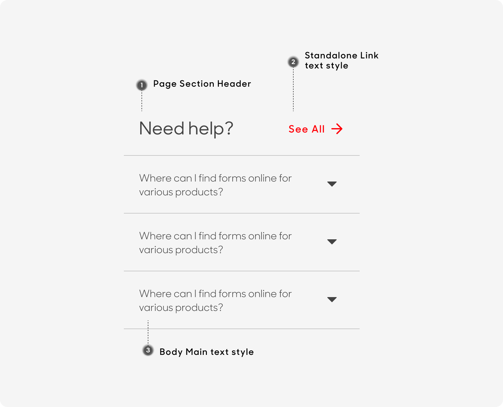
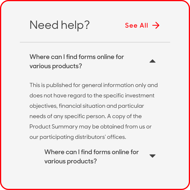
Accordions without color
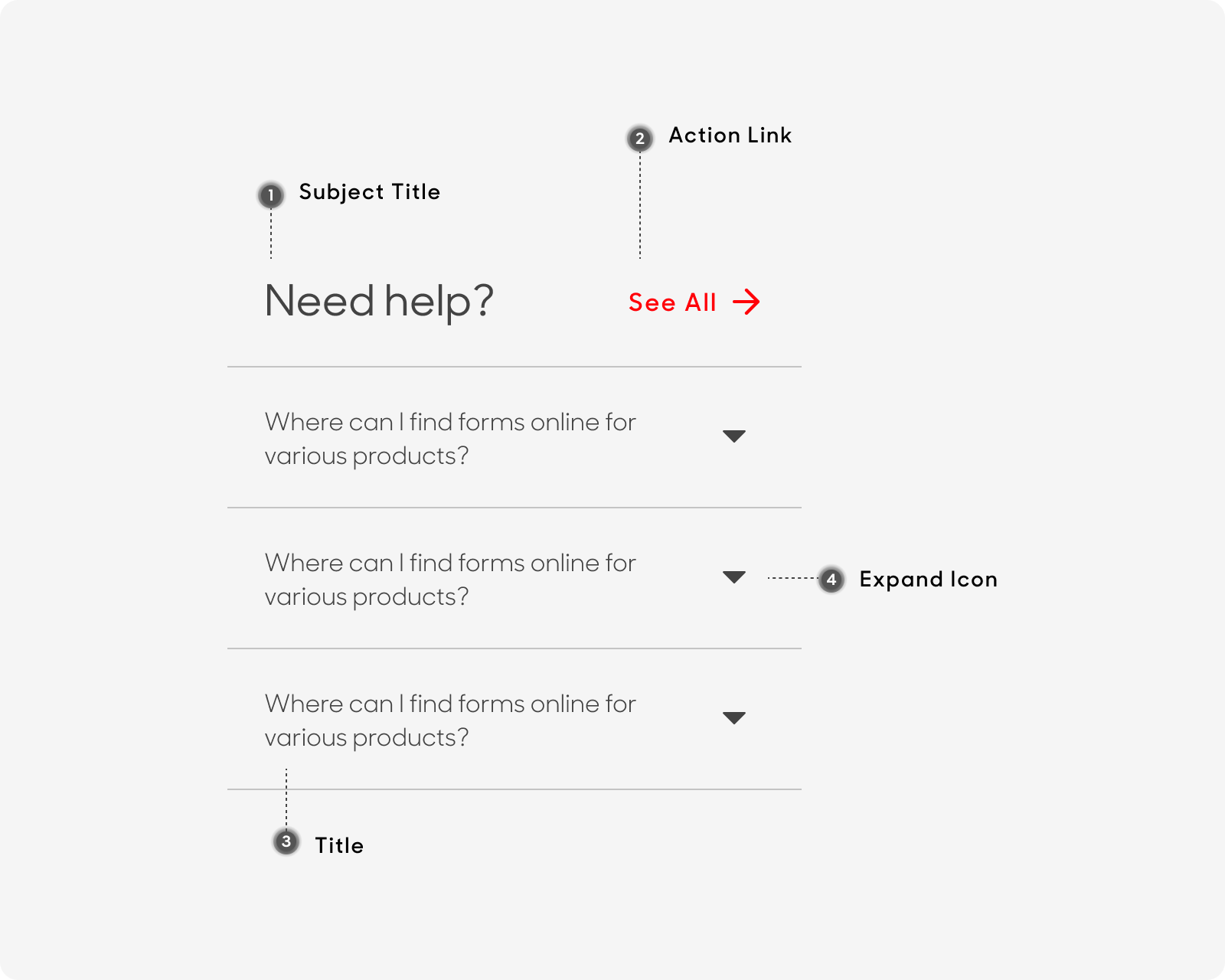
Accordions without color are made up of the following:
- Subject Title: Overview title of Dropdown List.
- Action Link: Standalone link to direct user to page with full relevant content.
- Title: Sub-header and control for revealing the Information Panel.
- Expand Button: To expand and collapse the Dropdown List.
Size
- Desktop:
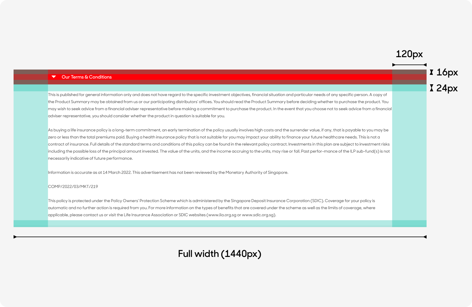
- Accordions with color: Stretches from screen edge to edge, beyond the desktop grid system. Height is variable according to the length of content.
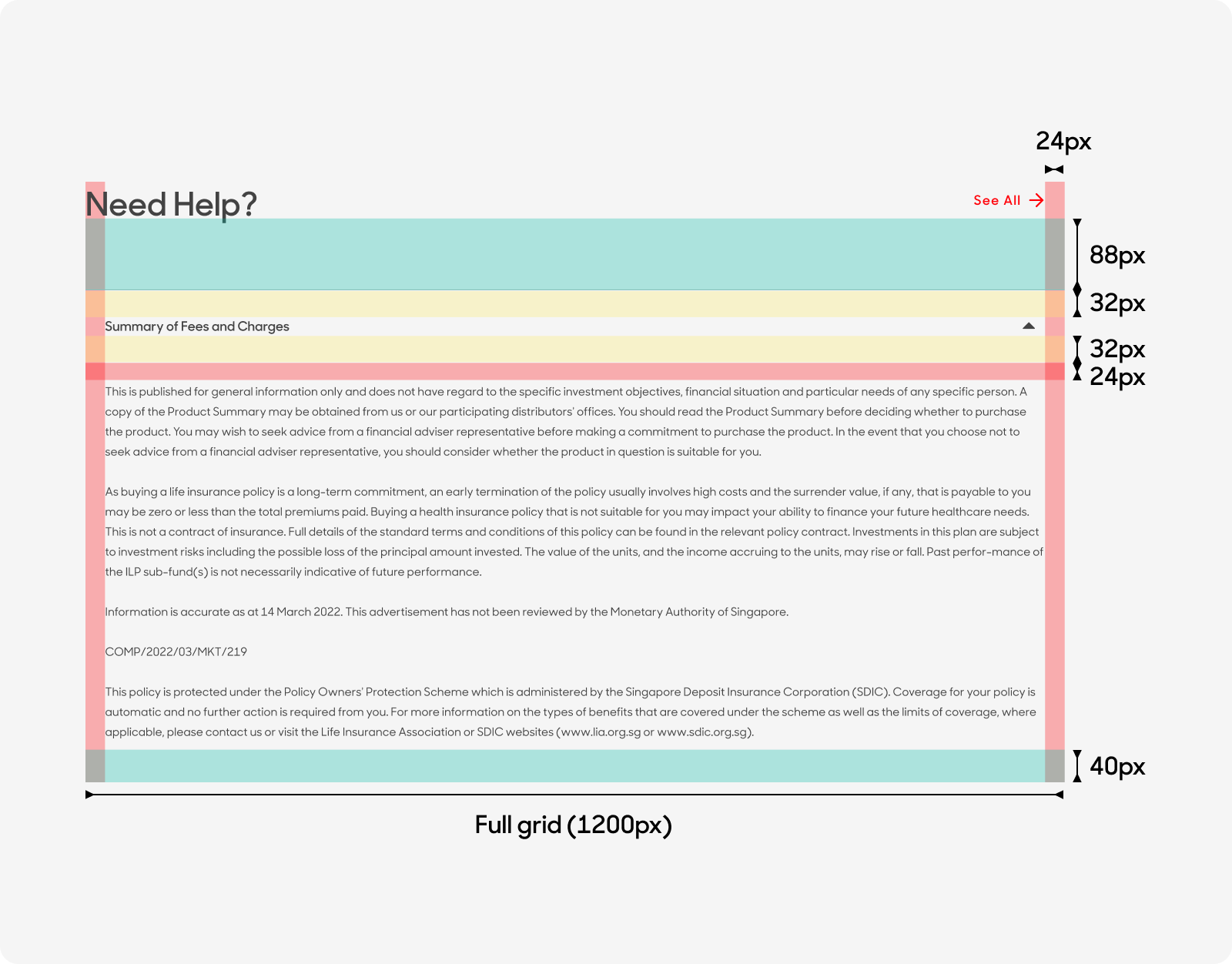
- Accordions without color: Spans across the desktop grid system (12 columns). Height is variable according to the length of the content.
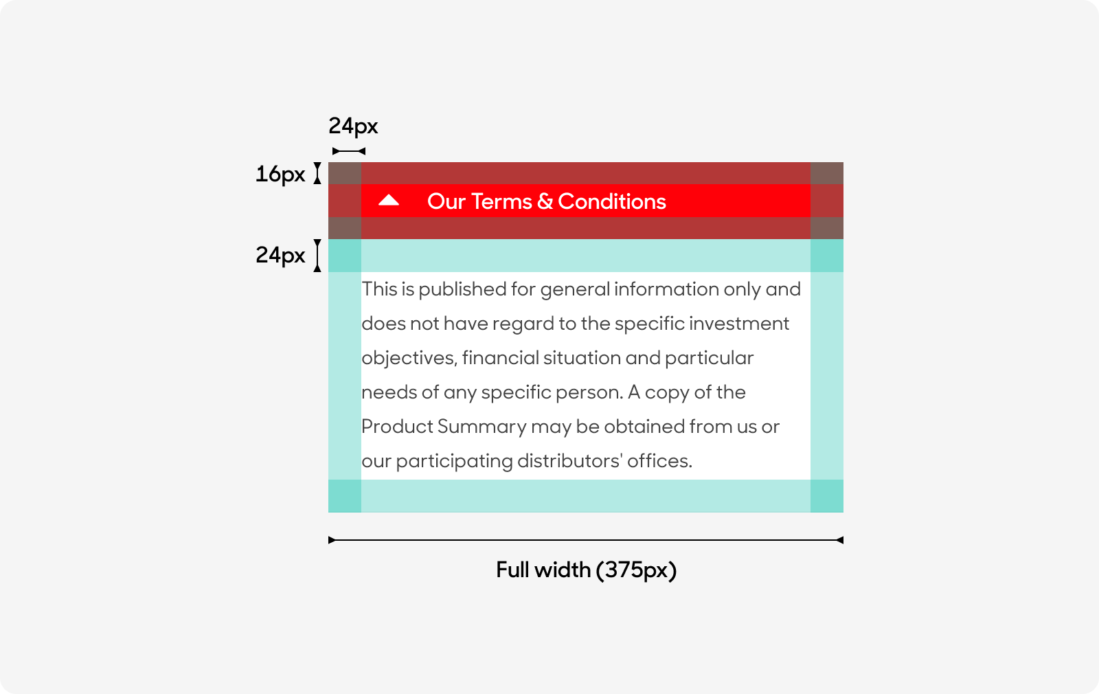
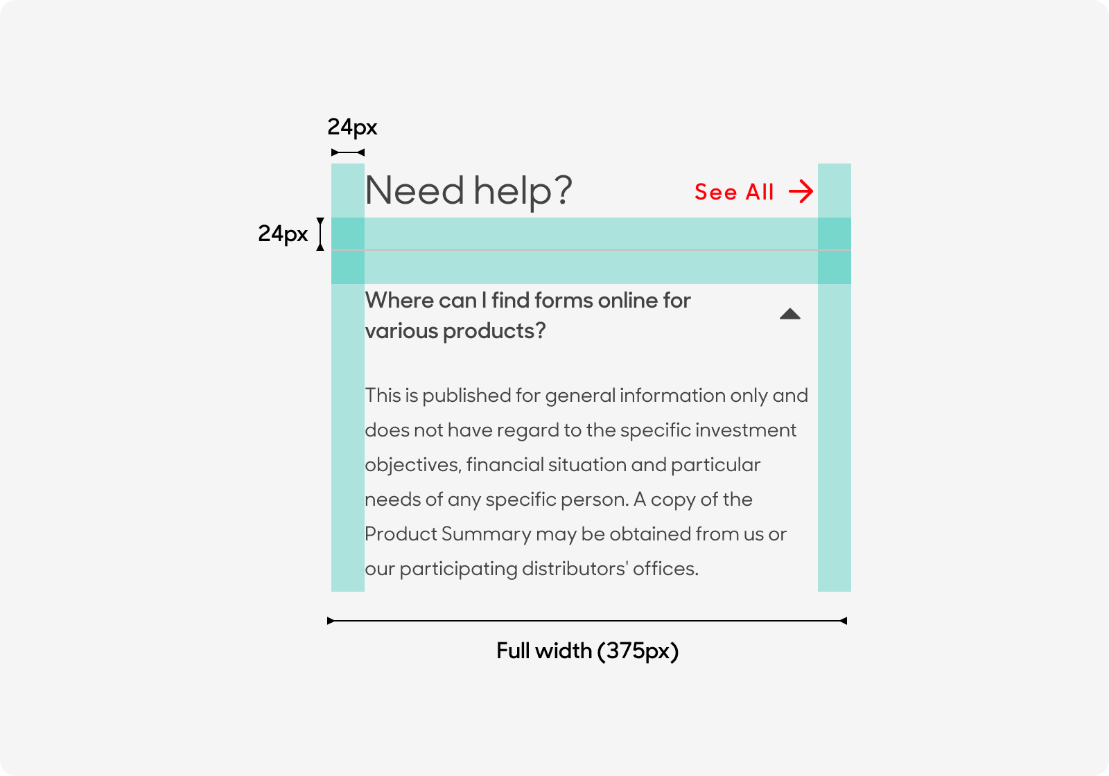
- Mobile: For both variants of accordions, stretches from the screen edge to edge, beyond the mobile grid system. Height is variable according to the length of the content.
Desktop
Mobile
Text Style
For Accordions with Color
- Header text size at 16px, sentence case (i.e. Click here, Sign up now) and use “Emphasis” text style on Figma.
- Panel text size at 14px. Use “Misc/T&Cs - Long Notes” text style on Figma.
For Accordions without Color
- Use “Page Section Header” in Figma text styles for main header.
- For call-to-action link button, use “Standalone Link” text style on Figma.
- For main body text, use “Body Main” text style on Figma.
Dos and Don'ts
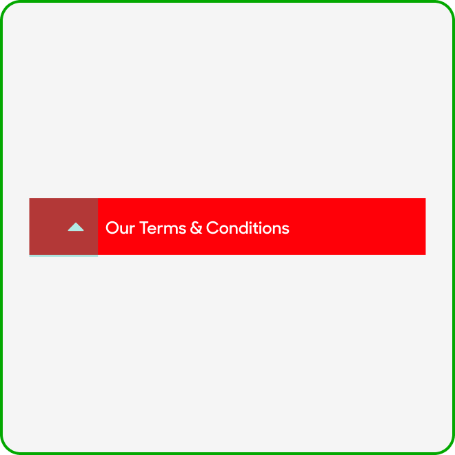
For accordions with color, always keep the chevron to the left where it will be aligned to the panel text.

Combine or stack accordions on top of each other.
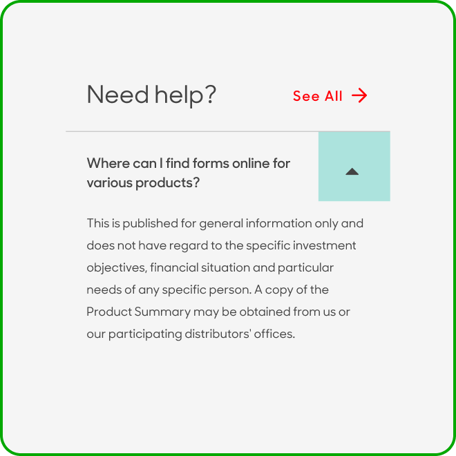
For accordions without color, always keep the chevron to the right.
Nest or place accordions within accordions.