Buttons
A button allows, initiate and informs people of an action.
Variants
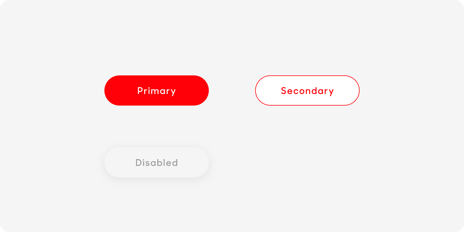
Primary Button
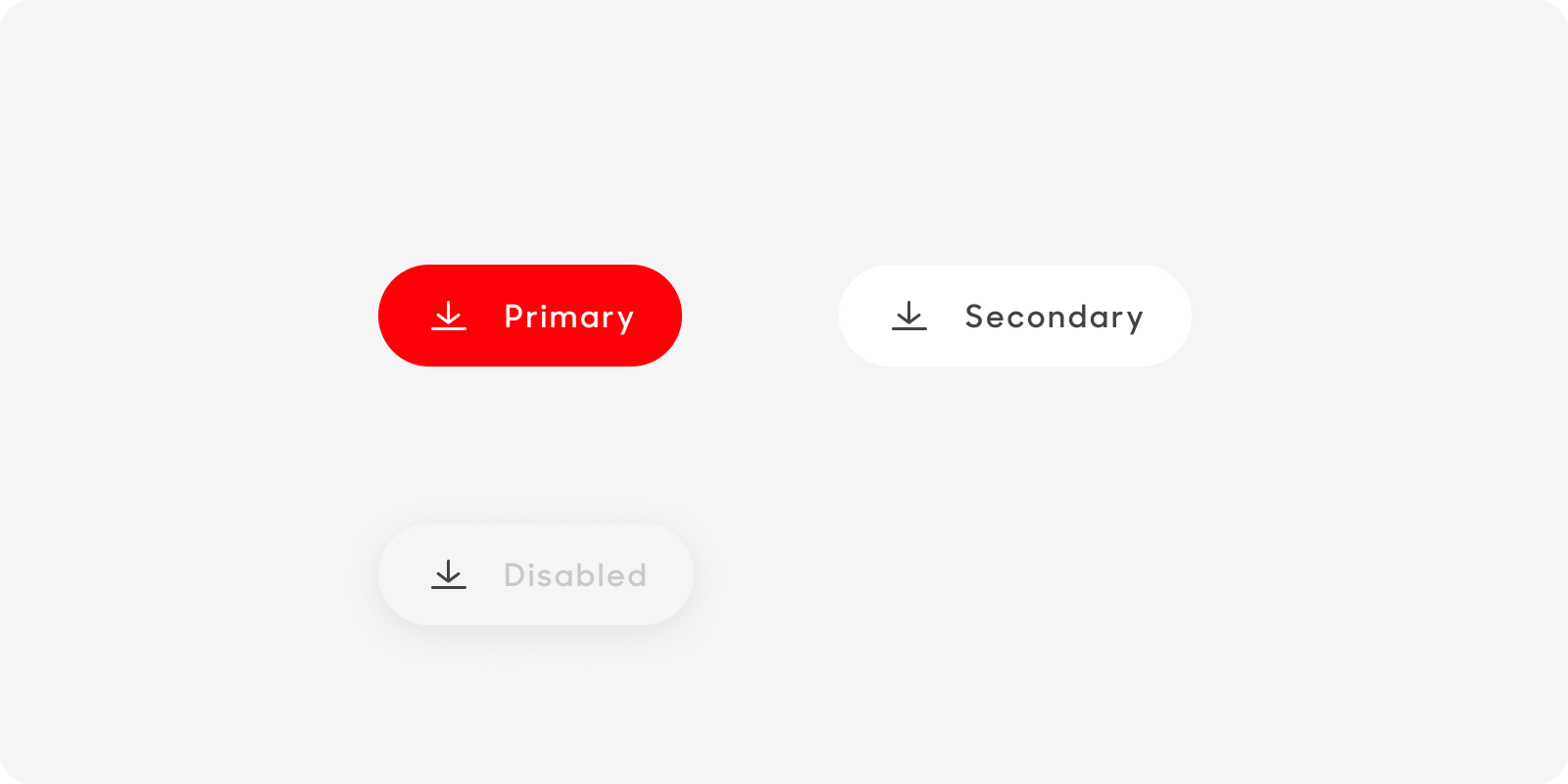
Button with Icon
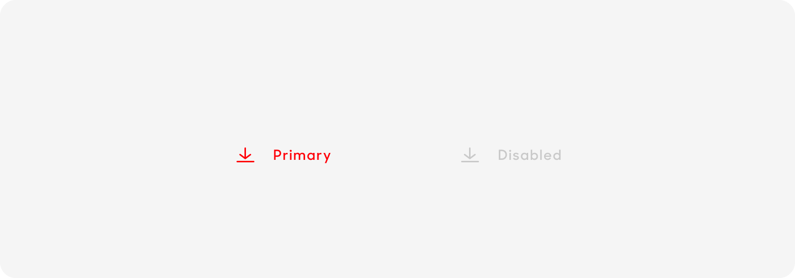
Text with Icons
| Variant | Usage |
|---|---|
|
Primary |
Use this for the main call-to-action button, |
|
Button with Icon |
Use this for secondary and independent actions. This can be used in isolation or paired with primary button. |
|
Text with Icon |
Use this for buttons that are not clickable for the user. |
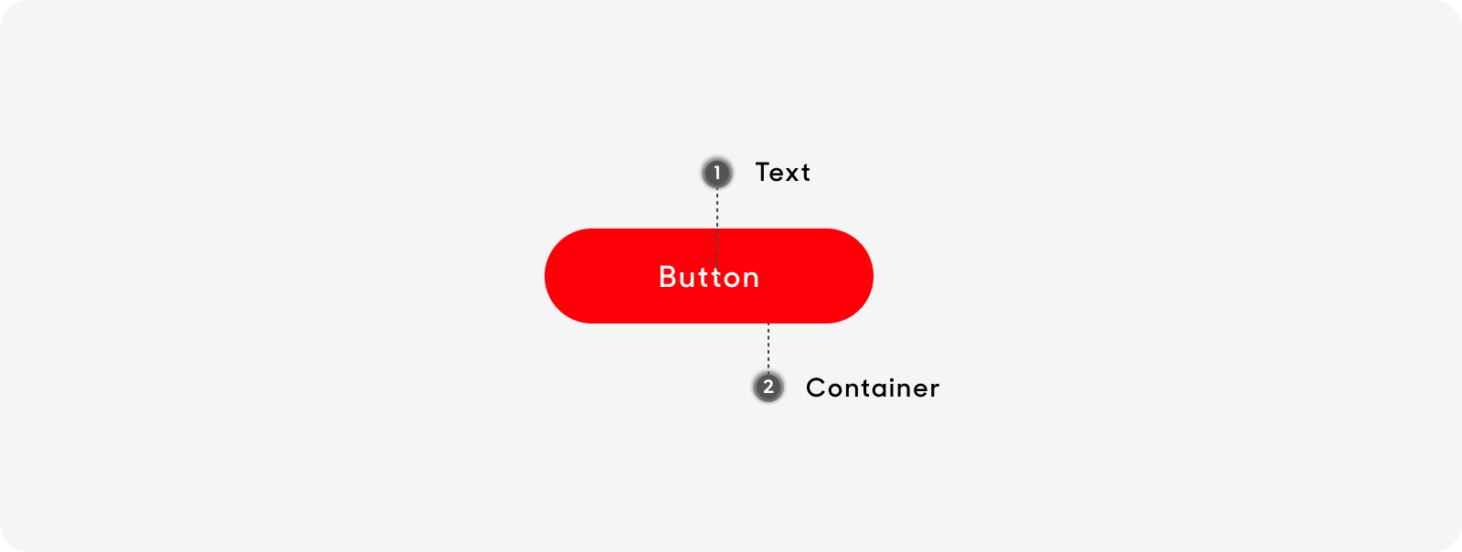
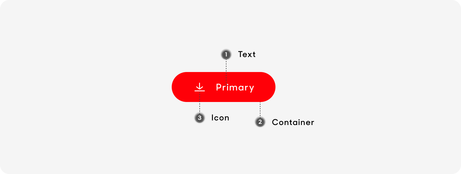
Anatomy
All rectangle button types share the same anatomy and are made up of the following:
- Text label: Text labels can expand
- Container: Containers can expand, and can be solid or outlined
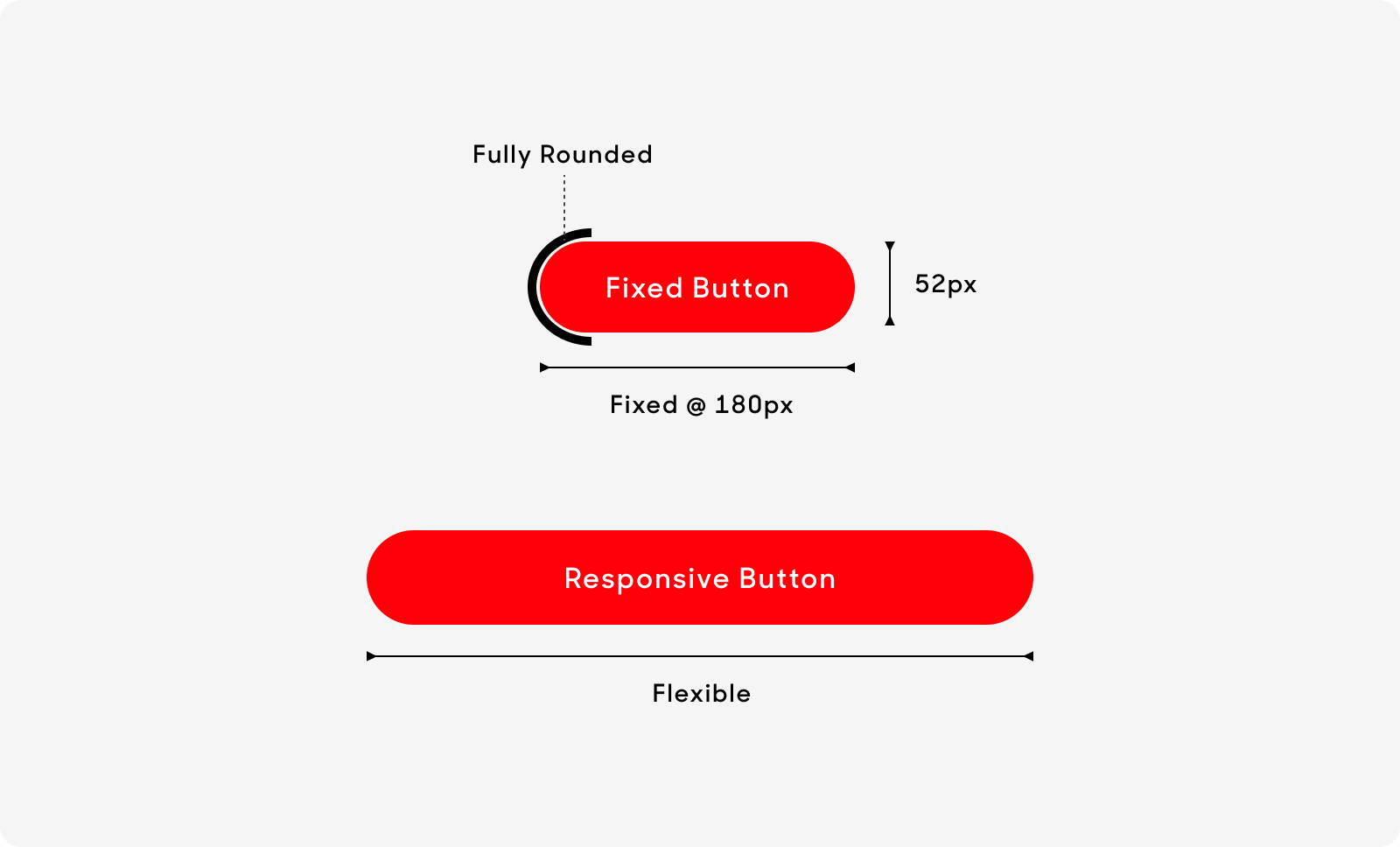
Size
There are 2 width sizes across all buttons. Height is fixed at 52px
- Fixed: Button width remains at 180px
- Flexible: Button width varies and should stretch according to grid design
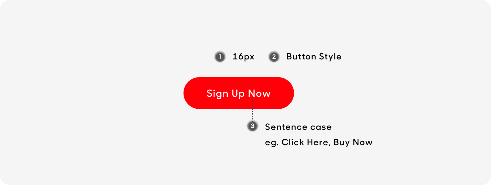
Text Style
All text labels in our buttons have the same text size:
- Text size at 16px.
- Title case (i.e. Click here, Sign up now).
- Use “Button label” text style on Figma for all button types.
Dos and Don'ts
When stacking buttons, limit to 2 and Primary always at the bottom.
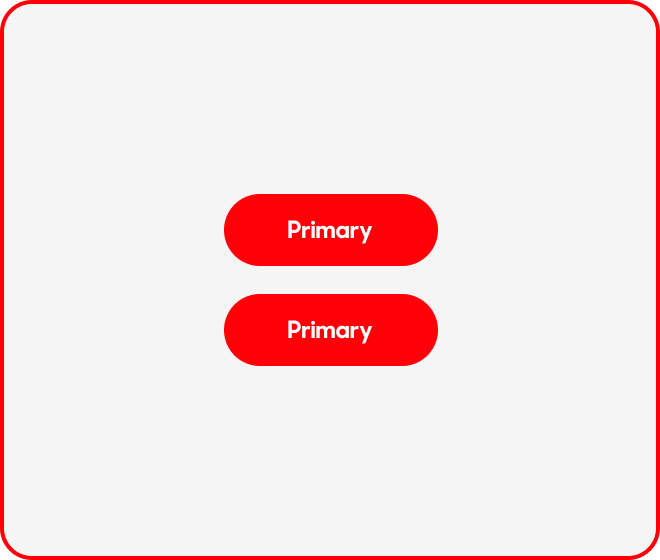
Do not use same variant whether it’s stacked or side-by-side.
In a side-by-side placement, limit to 2 and Primary always at the bottom.
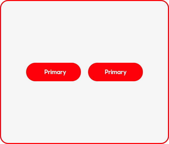
Do not use same variant whether it’s stacked or side-by-side.